
130 comments found.
Some time ago there was a sale of the plugin. Do you plan to sell in the future?
Hello foxytrail,
there are no planned promotions at the moment.
Hope this helps. If you need more info feel free to ask.
any back end or admin demo page I can try?
Hello sutantoedy,
there isn’t a back-end demo but the important aspects of the back-end are covered in the video available in the “Video Tutorials” section of the demo page.
Hope this helps. If you need more info feel free to ask.
Hi, i have some questions.
1. Can i import from excel to your plugin? 2. Can i export to excel from your plugin? 3. Can i add manuel data sheet (like table) create new chart in your plugin? 4. Your plugins CSS CLASSes, crush any WP themes on envato? For example: same name css class proglem any theme or plugin.
5. Can i add new chart in post or page (no close page, add basicly chart in popup edit same window) ?
Hello sinayes
1. Yes you copy from Excel to the embedded spreadsheet.
2. You can copy the data from the embedded spreadsheet, not the chart configuration or dataset properties obviously.
3. I don’t understand this question.
4. The chart make use of the HTML canvas element, CSS are not used in the front-end.
5. The charts can be added in posts, pages or custom post types.
Hope this helps. If you need more info feel free to ask.
Hello,
Can I import JSON formats? Will the charts be auto updated?
Hello deejaynamo,
no, the data should be manually udated from the plugin back-end and can’t be automatically updated based on external sources.
Let me know if you have other questions.
Hello! It´s possible add a Watermark in charts?
Hello Latamclick,
UberChart doesn’t include this feature.
Let me know if you have other questions.
I have UberChart and wonder if there’s a way to include point data within a line chart without having to hover. I want it to display automatically instead of being hidden until hover over.
Hello abfriesen,
for support please ask with the account that you used to purchase the item. This allows me to verify the license.
Thank you.
I got it through Envato Elements. I licensed it to ychc-local-site.flywheelsites.com. It’s a stage site for now.
Hello abfriesen,
I confirm you that the single data-point values are displayed only with the tooltips. There isn’t an alternative method at the moment.
Let me know if you have other questions.
When is the update?
Hello tourjoin2,
are you looking for specific new features or you are asking in general?
Thank you.
Using avada theme. I can not make a new chart about 4 months ago. Thank you
Hello tourjoin2,
if you have a specific issue please contact me via the support tab and add more details, or alternatively create a temporary WordPress account that allows me to inspect your WordPress installation back-end.
Thank you.
Can this plugin import CSVs from a URL? Or possibly read from a Google Sheet doc?
I need a chart plugin that is able to read data from a CSV via URL. The CSV file is updated automatically via another service and is found at a static link, so the plugin would be reading that.
Hello zenixnet,
Can this plugin import CSVs from a URL? Or possibly read from a Google Sheet doc?
No, the spreadsheet data should be manually copied from your spreadsheet to the spreadsheet embedded in UberChart.
I need a chart plugin that is able to read data from a CSV via URL. The CSV file is updated automatically via another service and is found at a static link, so the plugin would be reading that.
I consider your suggestion for future updated but I can’t guarantee at the moment.
Let me know if you need more info.
Can we delay the animations until the chart is in view? We need charts down the page rather than at the top and want our visitors to see the animation.
Hello coderraltd,
the charts are animated when the document is loaded and currently there isn’t an option to postpone the animation when the chart is actually viewed by the user.
Let me know if you need more info.
Hi guys, i would really appreciate a reply on my inquiry above. Thank you
Hello learnea, I just replied to your question above.
Hi there i purchased your chart today, but there is no option to add Dataset when i am creating a chart.
please help. otherwise this plugin is useless
Hello learnea,
to add a new dataset please proceed as follows:
- Increase the number of rows with the Rows field
- Edit the new row added in the Data field through the embedded spreadsheet editor
Please note that more information on how to use the plugin and the video tutorial series are available in the plugin manual available in the “doc” folder of the pack downloaded from CodeCanyon.
If you need help with a specific table or for other support question please use the Support tab available in this page.
Thank you.
i need to change the preview setting of the dataset 2, 3, 4 … meaning i want to change the colour, the name(label), etc i know that i can change the values, but nothing else. is it ok to ask for a refund? because i think it is quite difficult to manage.
Hello learnea,
if you want to use the plugin and you have questions on specific aspects or you need help on creating specific charts send your detailed question with related screenshot or WordPress credentials via the Support tab.
If instead you are interested in a refund contact me via the Support tab so I can tell you the exact procedure to get the refund.
Hope this helps.
hi there – love the plugin! the charts are amazing… I’m wondering though two things….
1 – how do i create the Radar area chart with multiple datasets, to show like you have it in your demo with the circular type of look, and the categories showing on each of the points rather then an x and y graph?
2 – is it possible for the Polar Area graph to display the legend/categories around the graph rather then just on top?
thanks
Hello mesteve01,
1 – how do i create the Radar area chart with multiple datasets, to show like you have it in your demo with the circular type of look, and the categories showing on each of the points rather then an x and y graph?
Please proceed as follows:
- import the default models with this procedure
- load the “Radar Chart with multiple datasets” model from the UberChart -> Chars menu
- customize the default categories with your categories with the first row of the “Data” field (with the embedded spreadsheet editor)
2 – is it possible for the Polar Area graph to display the legend/categories around the graph rather then just on top?
The legend can be positioned with the Legend -> Position field in the Top, Right, Bottom or Left side of the chart but not around the various slices of the chart.
Please note that the terms of the legends and the related values are also available in the tooltips if enabled.
Hope this helps, if you need more info feel free to ask.
Amazing yes very helpful thank you so much ")
Is there a way to have numbers in the thousands to have commas in my bar charts? If I add the commas in the data, it just cuts the number off there. Thanks!
Something like this possibly? https://stackoverflow.com/questions/38800226/chart-js-add-commas-to-tooltip-and-y-axis
Hello bitboyz, I just replied directly to your email.
Thanks!
Two questions: 1. is there a way to print the graphs. 2. is there a way to have limit the data set so you only see a date range that can be changed by the user?
Thank you!
Hello greenacresdesign,
1. is there a way to print the graphs.
Currently there isn’t a feature to print the charts.
2. is there a way to have limit the data set so you only see a date range that can be changed by the user?
No, the users can activate or deactivate specific datasets, but can’t define ranges that change the displayed data.
If you need more info feel free to ask.
Hi there if I bought this would there be any addon that I could get so that the user could edit the chart from the website? Im looking to do something like this: https://www.citypost.ie/calculator.php
Hello taranpyper,
no, I’m sorry but this is not possible with UberChart.
If you need more info feel free to ask.
Pre-sale question. Is it possible to use the plugin on the journal’s website in a such way: we want authors who write articles to have the option of adding charts to articles. Is there an option to publish from the frontend?
Hello pqinstitute,
the charts should be created from the UberChart -> Charts menu that is available only the in the back-end.
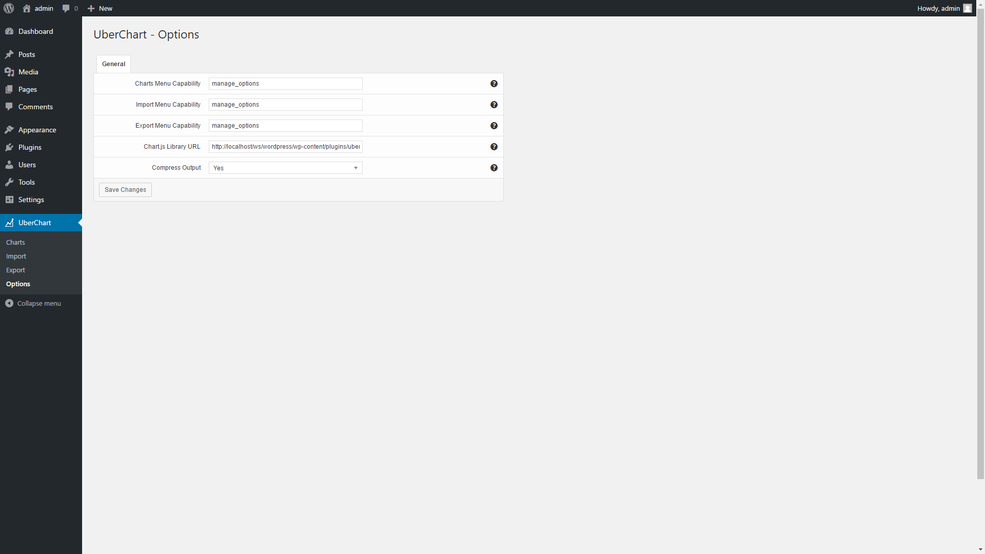
If you want, with the Charts Menu Capability option you can enter a capability that allows your authors to have access in the UberChart -> Charts menu. So they can create charts, get the shortcode associated with the charts and include the charts in the posts.
Hope this helps, if you need more info feel free to ask.
Hi, i have a pre-sale question. can the value display within or above the chart instead of the hover mouse event? Thank you.
Hello leonguyenbus,
no I’m sorry, the values are displayed with the tooltips activated with the hover mouse event.
Hope this helps, if you need more info feel free to ask.
UberChart 1.14 has been released
UberChart has been updated to version 1.14, more information on the changes applied with this version are available in the “Updates” section of the item description.
To update please proceed as follows:
- Backup your website
- In the Plugins menu click “Deactivate”
- Update all the plugin files via FTP
- In the Plugins menu click “Activate”
If you have any questions feel free to ask.
I am having trouble getting the charts to appear on a site I am working on. I created some that work fine on my own site but this site being on a client’s separate hosting account I am not sure what is going on. Can I send you login info and have you take a look? If so just let me know where to send.
Hello amullican,
please contact me through the “Support” tab available in this page with the details of the issue and the credentials of the account.
Thank you.
Hello
Can your chart do the following?
I want a chart for days on the X axis, but would like to default to +-3 days each week.
I would like the user to be able to define a different number of days forward and/or backward.
I would like the user to be able to scroll through the days, one at a time
I would like the chart to be able to dynamically show the units on the Y-Axis if someone were to hover over a lines point.
I would like the charts selection of data ability to be listed on the side instead of the top (clicking on and off data selections)
I would like a line to show on the graph when you mouse down and drag from one point to the next.
I would like a tool tip to show all values for a given day if a data point for that day is clicked on, or hovered over.
Is any of this possible? Thanks.
Hello webinscribe,
I’m sorry but these features are not available in UberChart.
If you need more info feel free to ask.
This item was featured on CodeCanyon
Elite Author
Contact the Envato Market Help Team
