
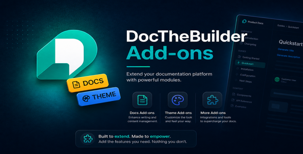
Docs Theme Addon for DocTheBuilder
Unlock a beautiful, Laravel-style three-column documentation theme for your DocTheBuilder platform. The Docs Theme addon gives your documentation sites a professional, developer-focused look inspired by laravel.com/docs — complete with collapsible chapter navigation, auto-generated table of contents, dark mode, and a signature red accent palette.
Install in seconds through the built-in addon manager. No code changes required.
Key Features
- Three-column layout — left chapter rail, centre article body, right sticky TOC
- Collapsible chapter rail — nested section navigation with expand/collapse
- Auto-generated table of contents — built from h2 and h3 headings on every page
- Dark & light mode — system preference detection plus manual toggle
- Syntax-highlighted code blocks — beautiful fenced code rendering out of the box
- Version badge in header — shows the current release version of your docs site
- Responsive & mobile-first — collapses to a slide-out drawer on small screens
- CSS custom property theming — override accent colours and surfaces in one place
-
Signature red accent —
oklch(50% 0.22 25)brand colour, fully customisable - HMAC-signed security — tamper detection on every request; reinstall to re-activate
How to Install
- Log in as a platform administrator.
- Go to Settings → Addons.
- Upload
docs-theme-addon.zipon the Docs Theme card. - Click Install — done. A green Active badge confirms activation.
Requirements
- DocTheBuilder platform v2.0.0 or higher
- PHP 8.2 or higher
- PHP extensions:
zip,mbstring -
ADDON_SIGNING_KEYconfigured in your.env
Changelog
v1.0.0 — May 2026
- Initial release
- three-column documentation layout
- Collapsible left chapter rail
- Auto-generated right sticky TOC
- Dark / light mode toggle
- CSS custom property accent system


