

AuthMaster – Premium Authentication UI Kit
AuthMaster is a comprehensive, production-ready authentication UI kit featuring 5 distinct themes and 6 complete authentication flows. Built with vanilla JavaScript and Tailwind CSS, this kit provides everything you need to create beautiful, accessible, and secure authentication interfaces for your web applications.
Key Features
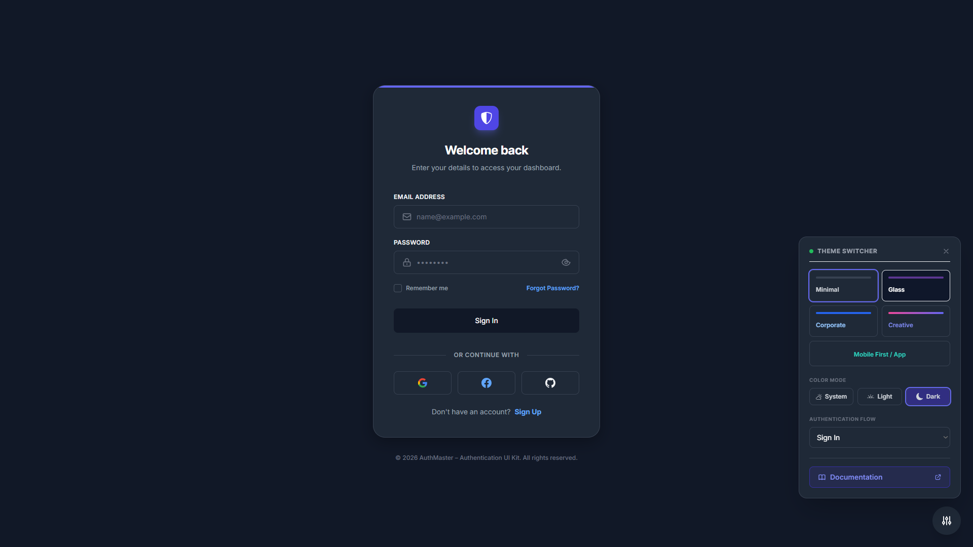
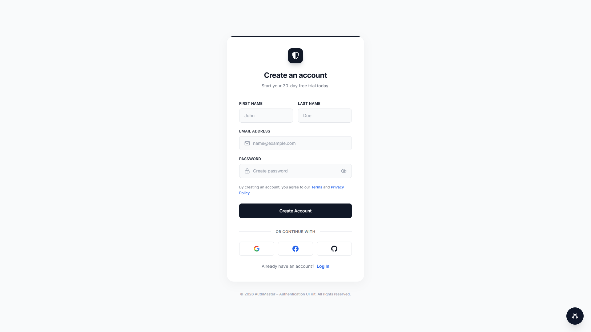
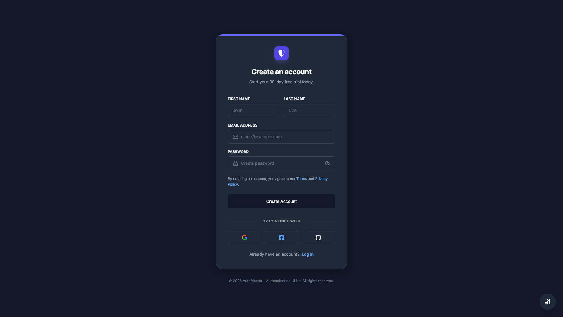
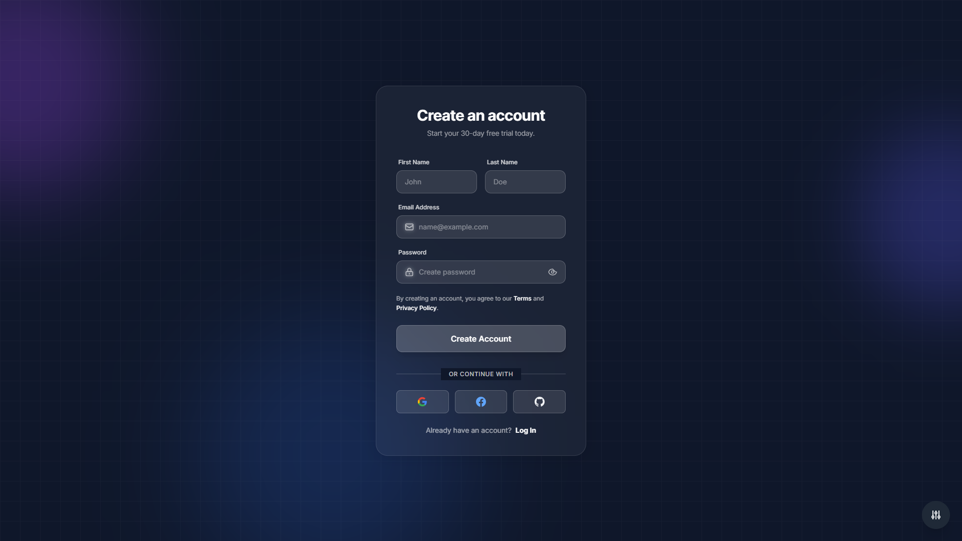
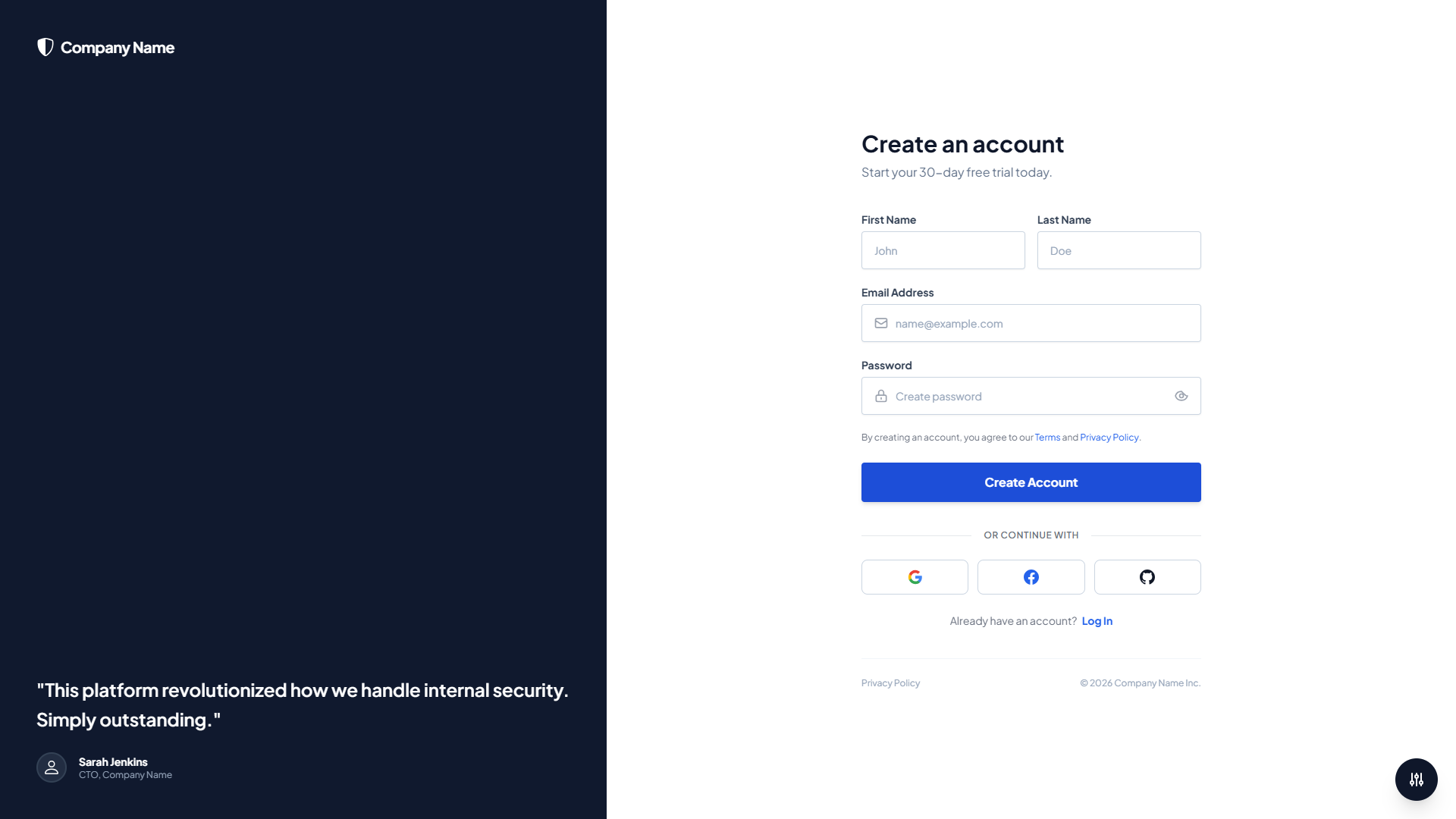
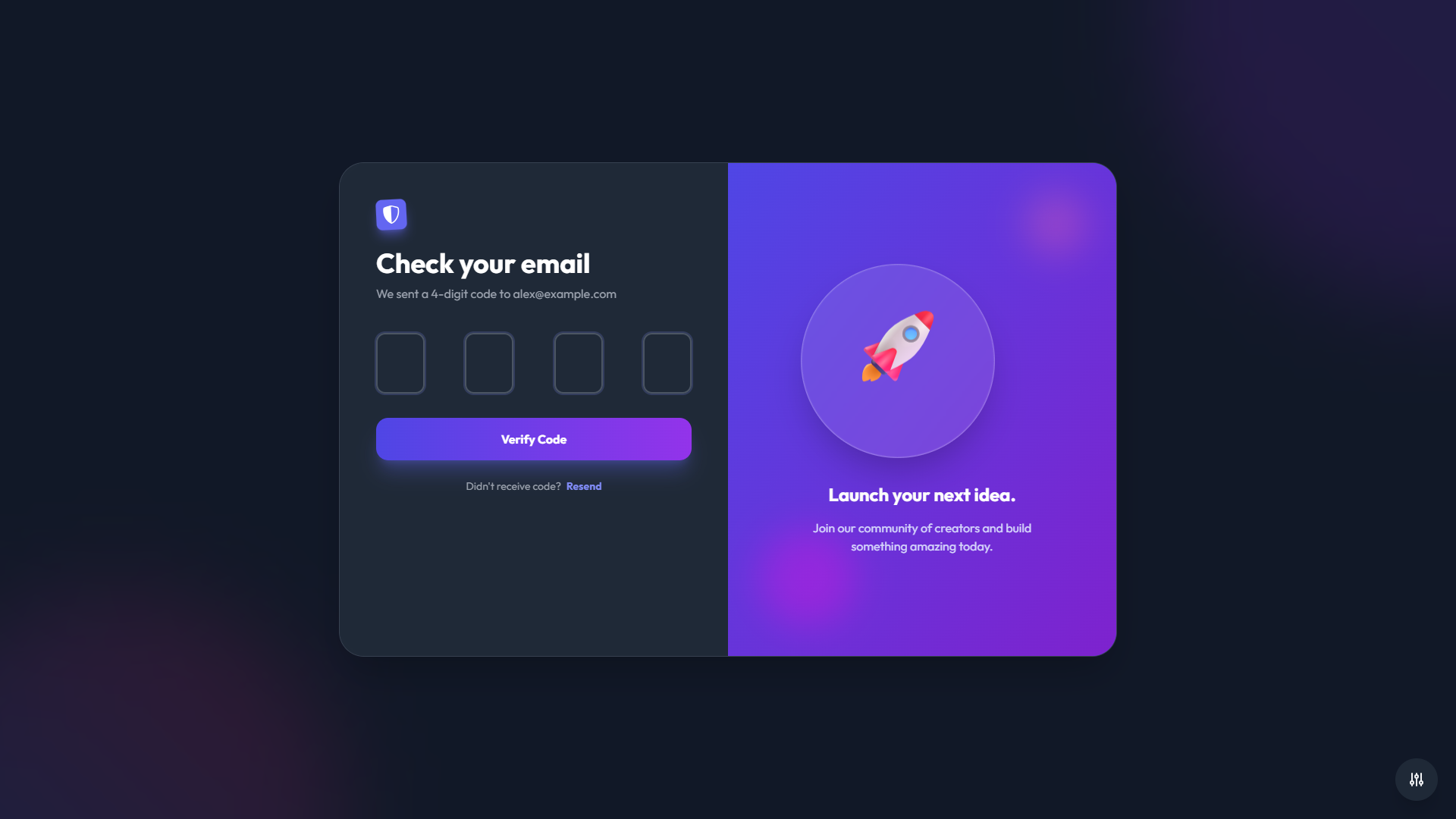
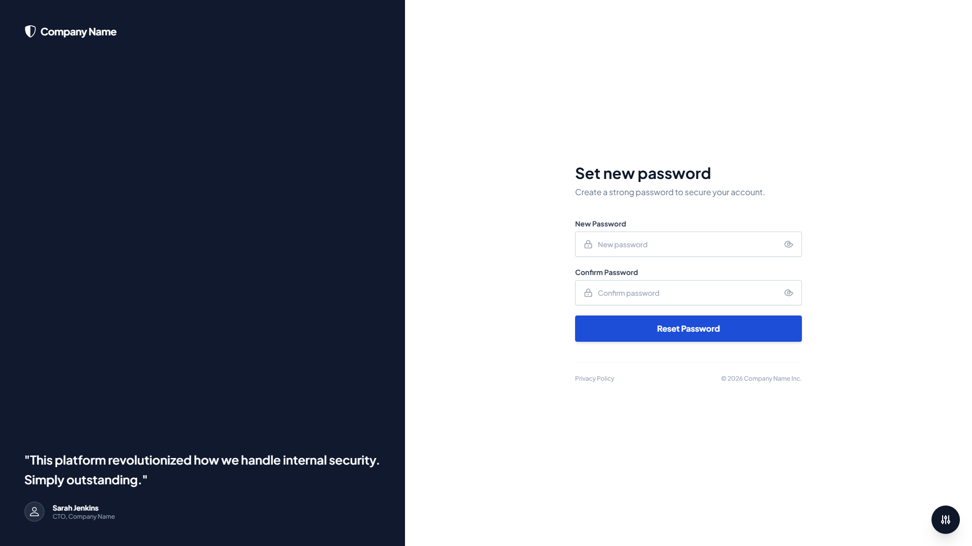
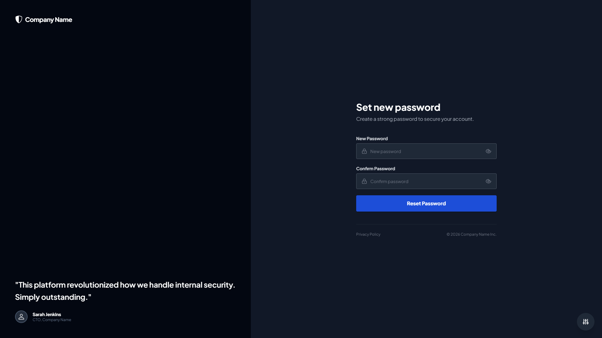
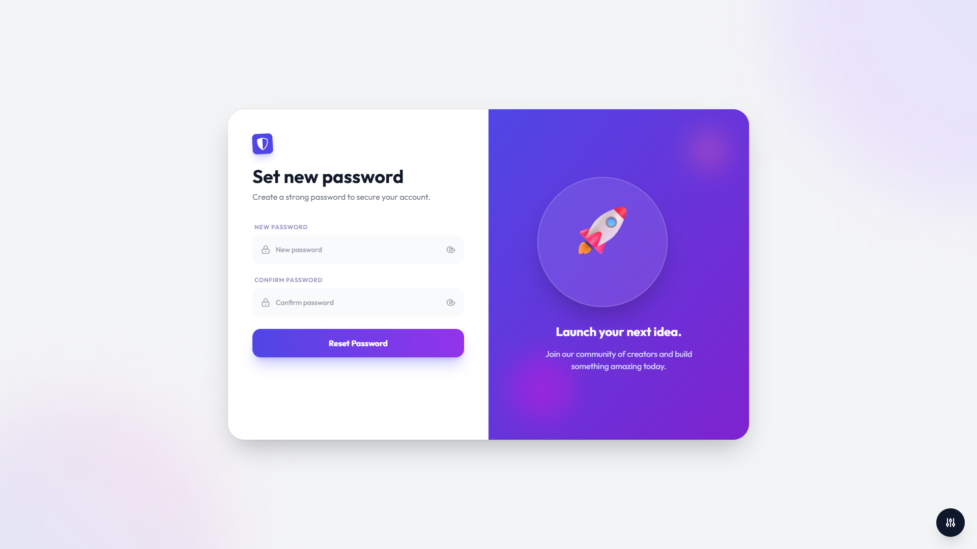
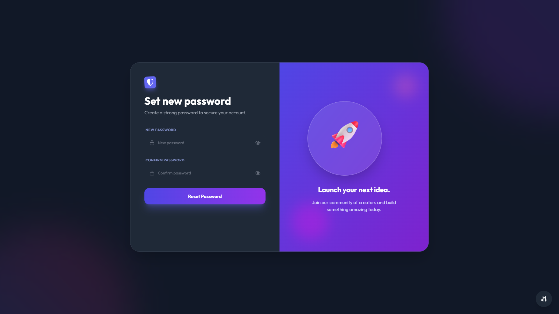
5 Premium Themes
Choose from five professionally designed themes, each with its own unique visual style:
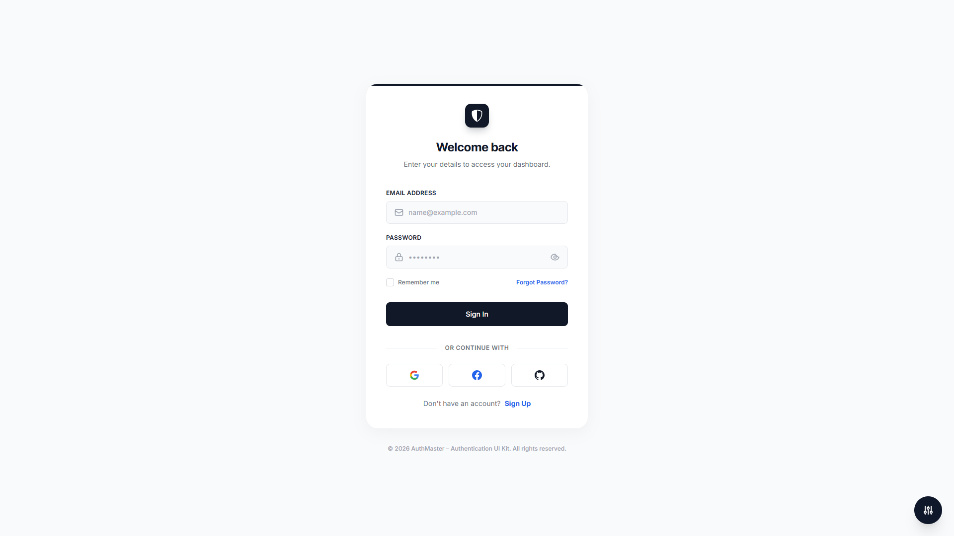
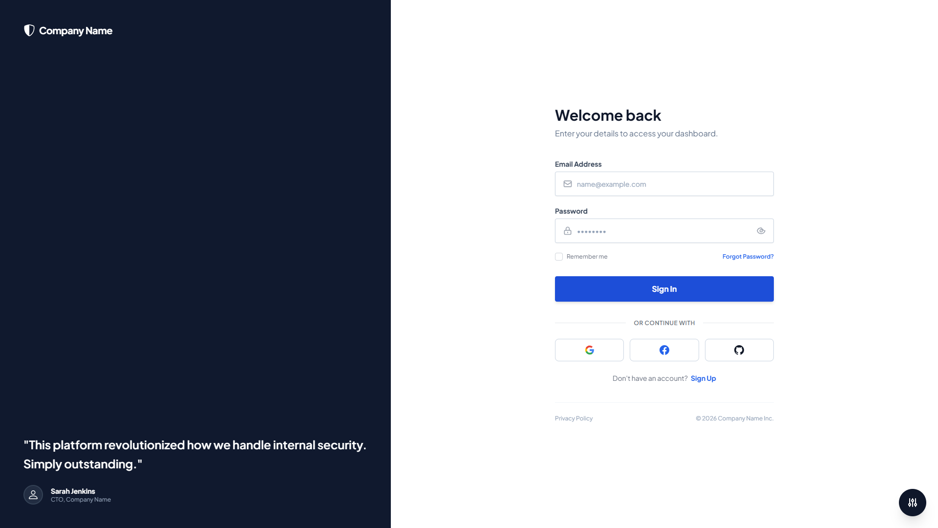
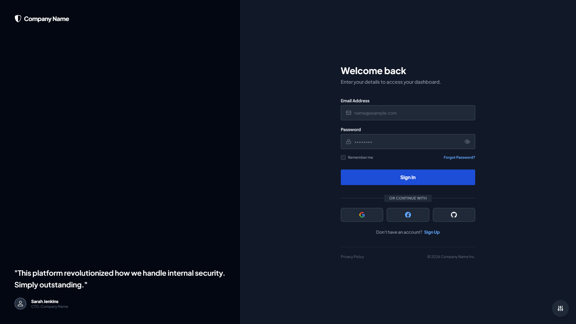
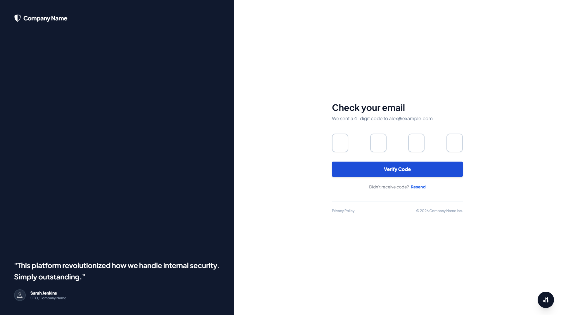
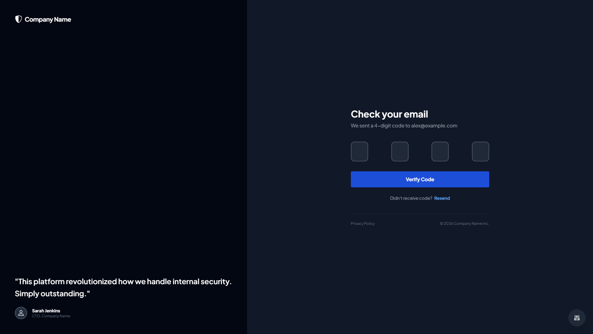
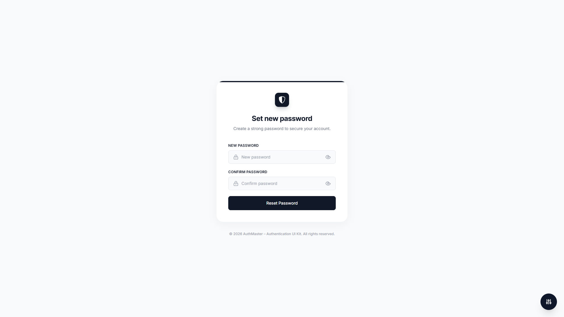
- Minimal Theme: Clean and simple design with subtle shadows and modern typography, perfect for minimalist applications
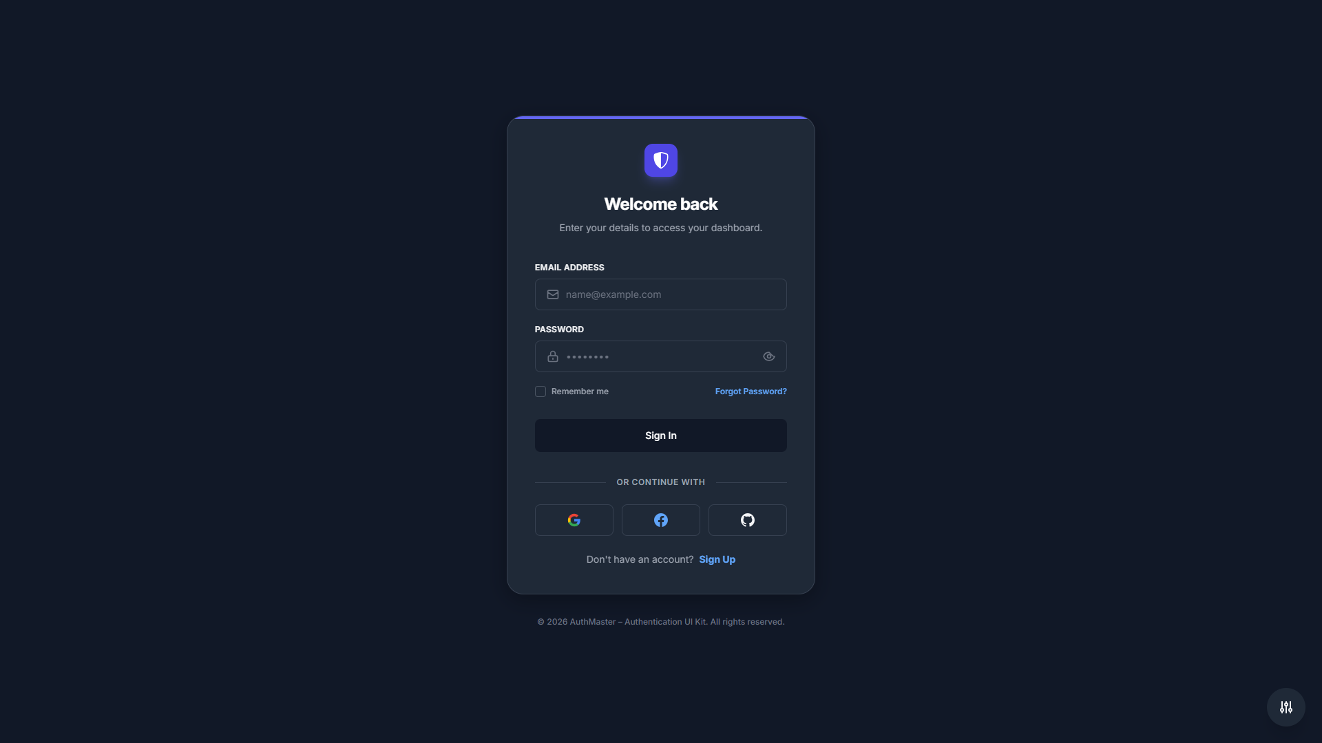
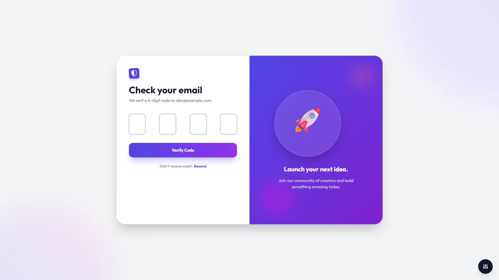
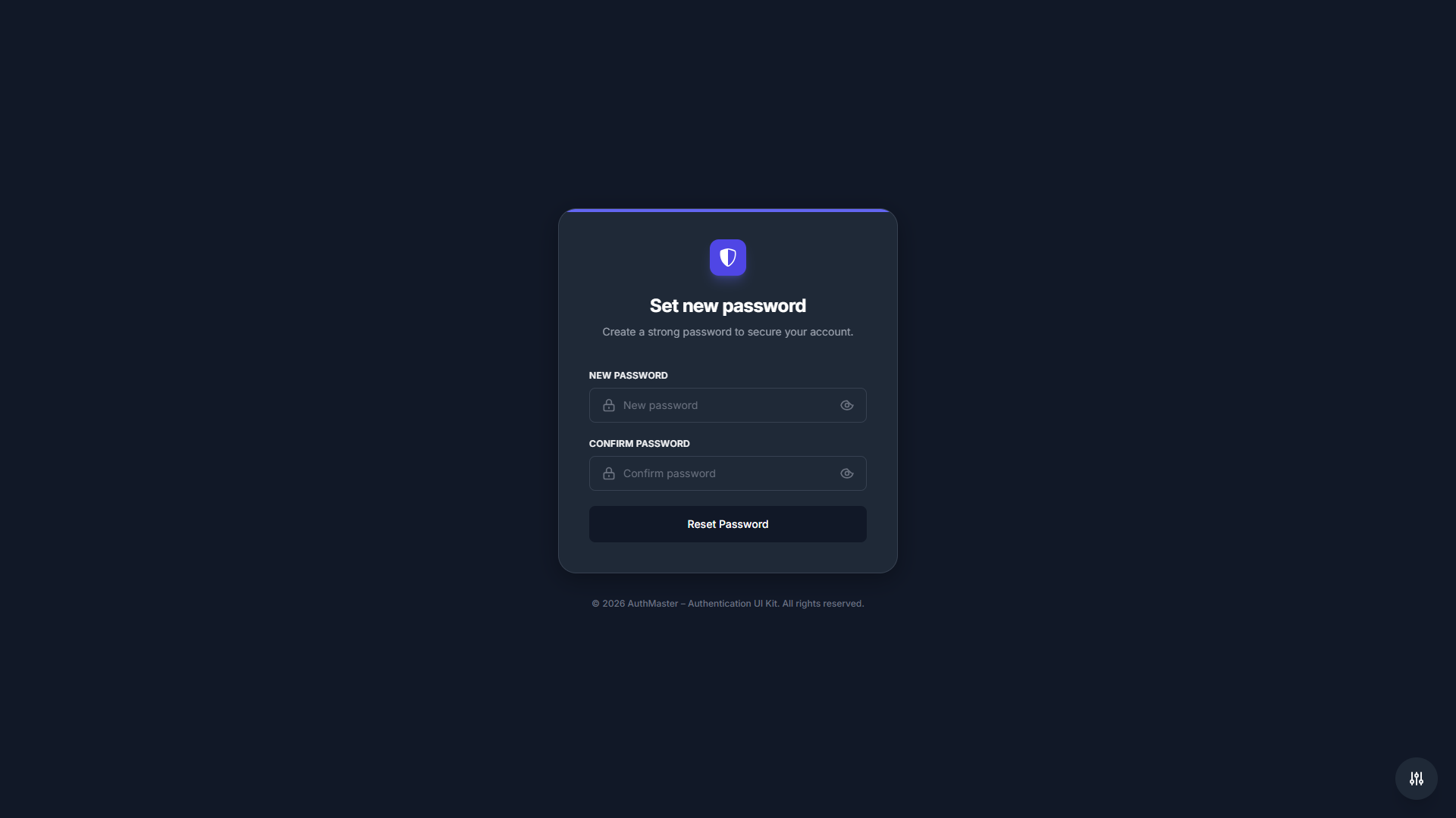
- Glassmorphism Theme: Modern glassmorphism effects with animated backgrounds, ideal for creative and futuristic applications
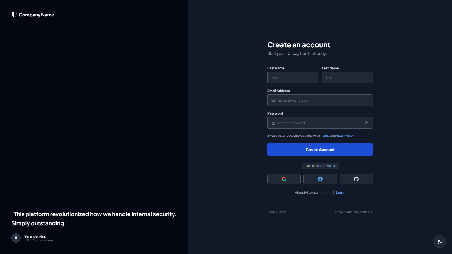
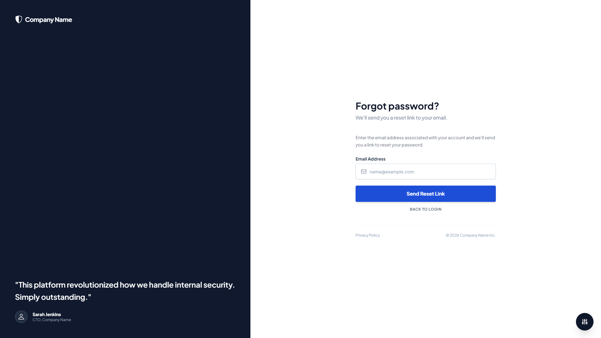
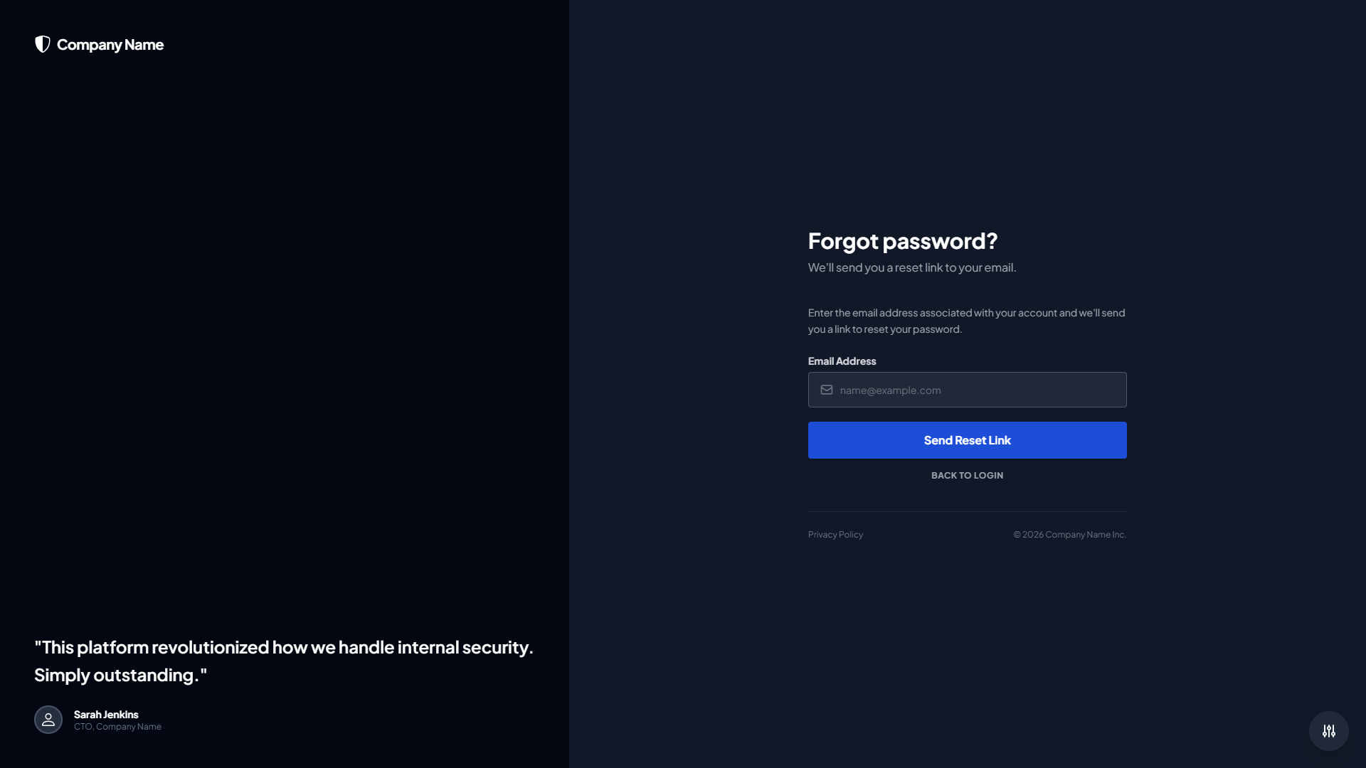
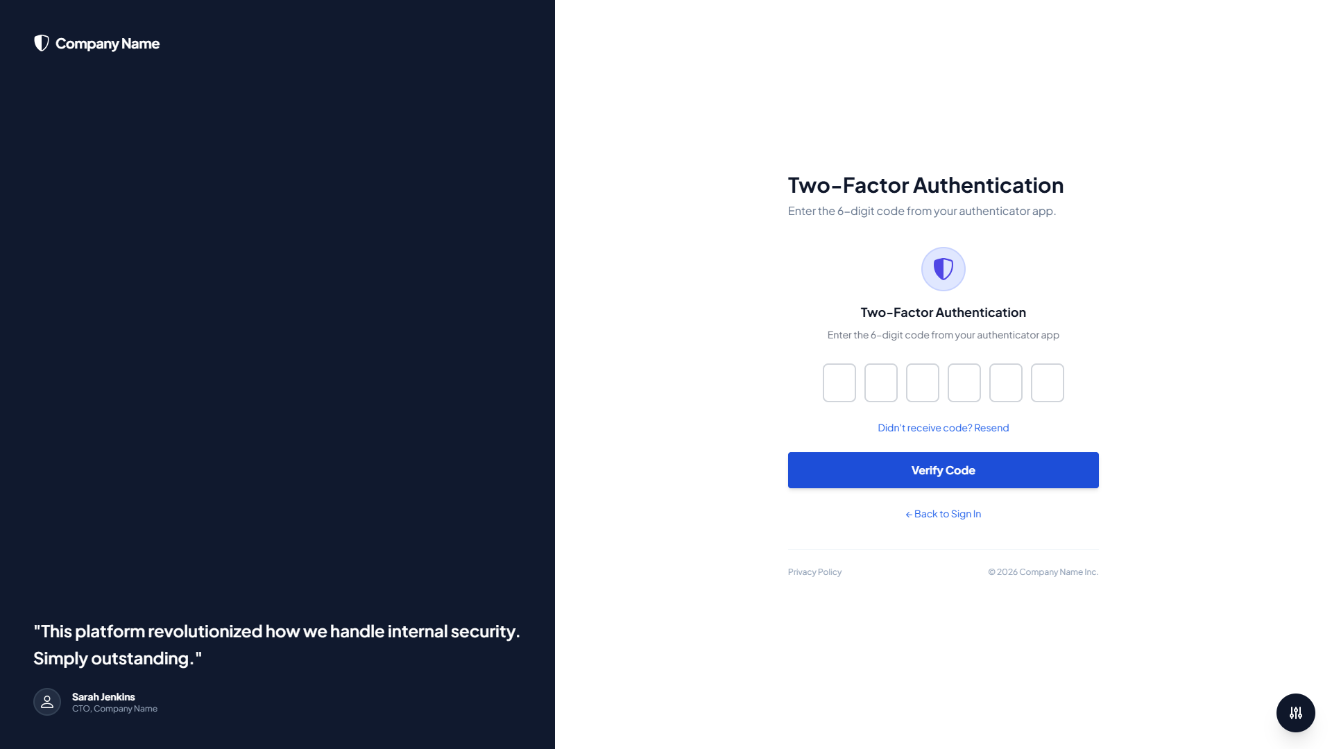
- Corporate Theme: Professional corporate design with sidebar layout, perfect for B2B applications and enterprise software with custom logo support
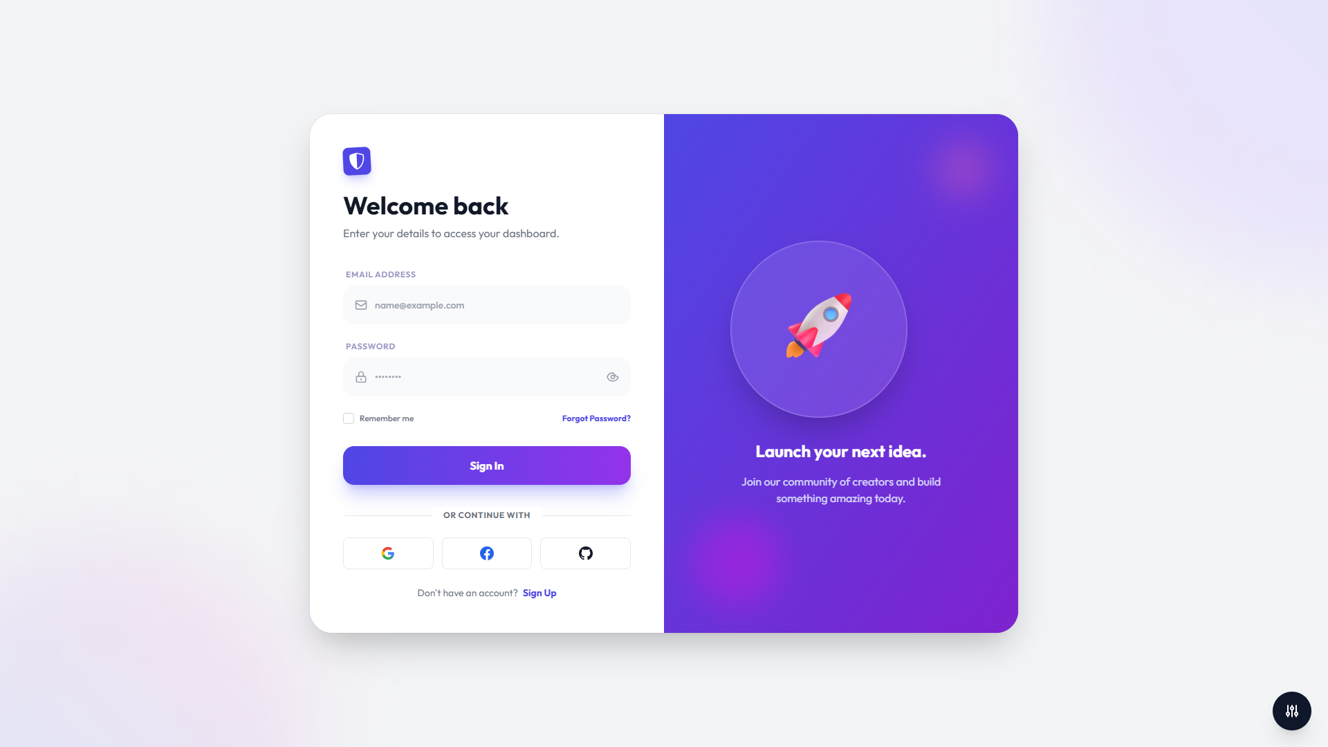
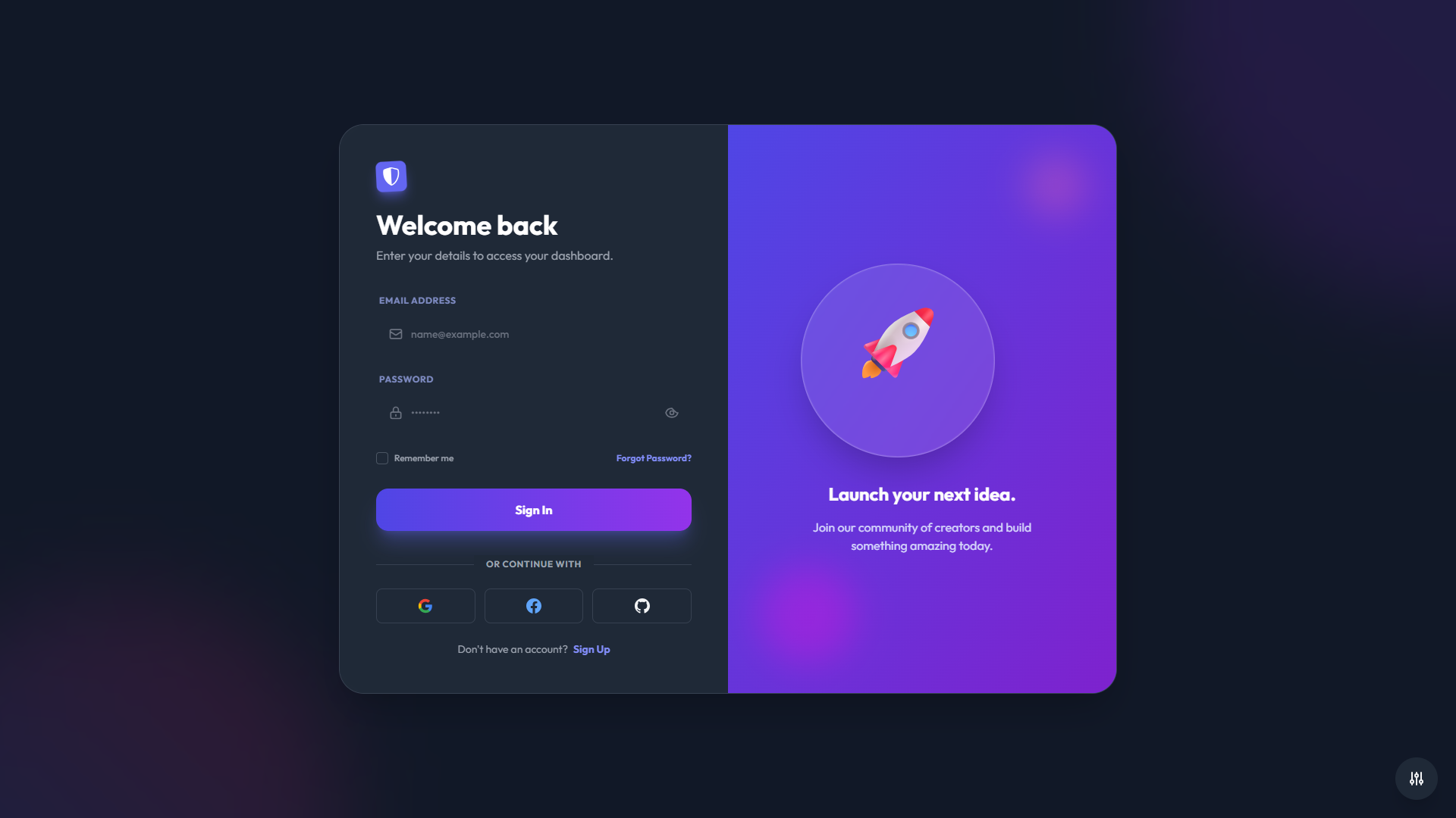
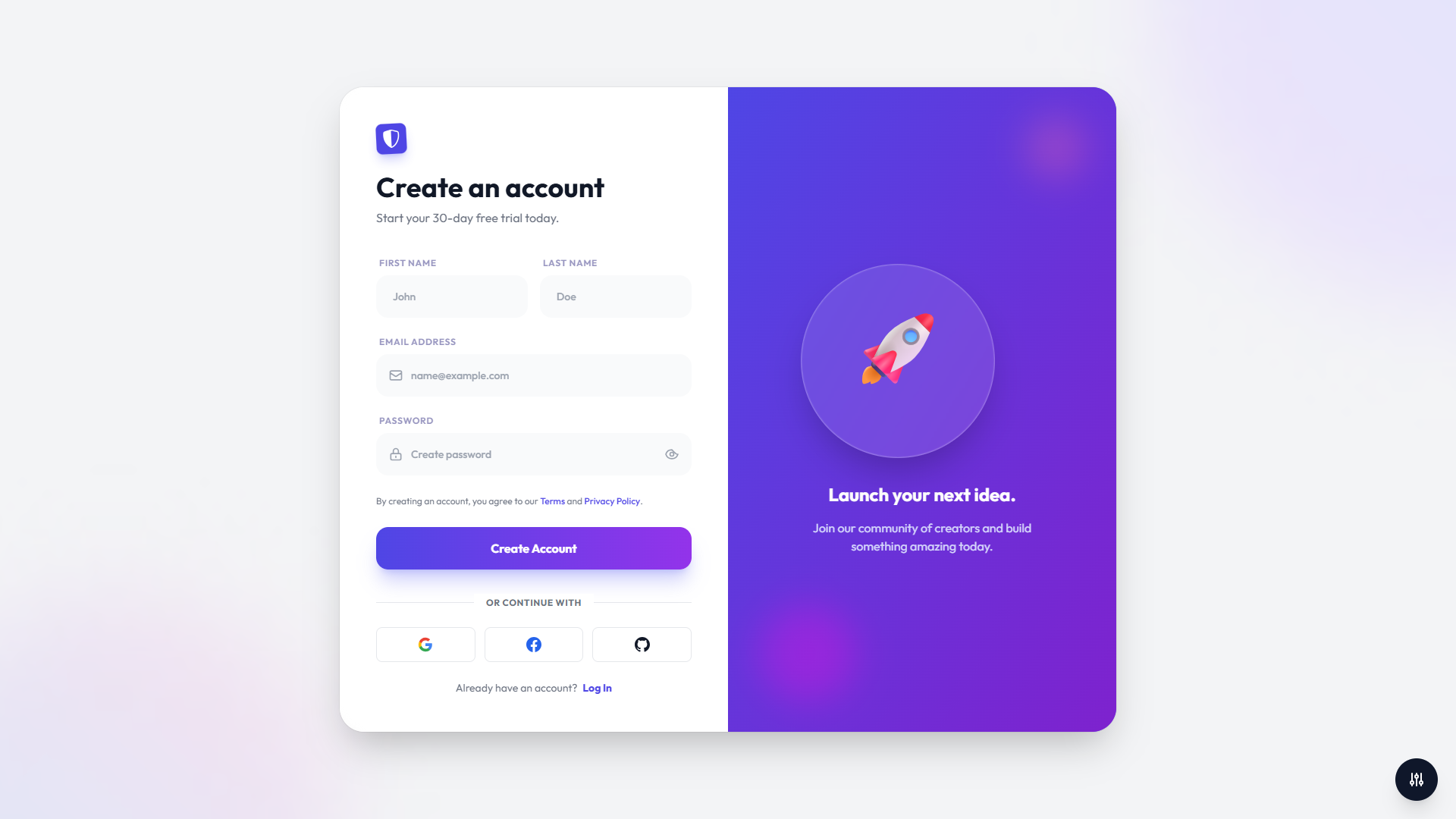
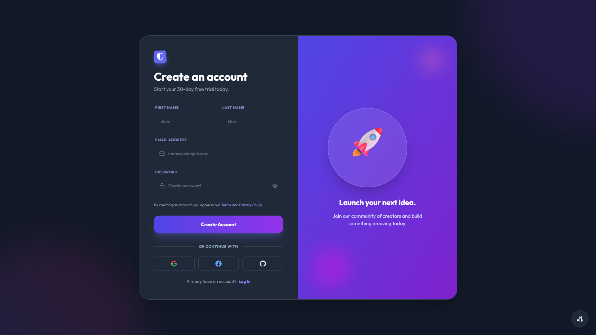
- Creative Theme: Bold and vibrant design with gradient backgrounds, great for creative agencies and modern startups
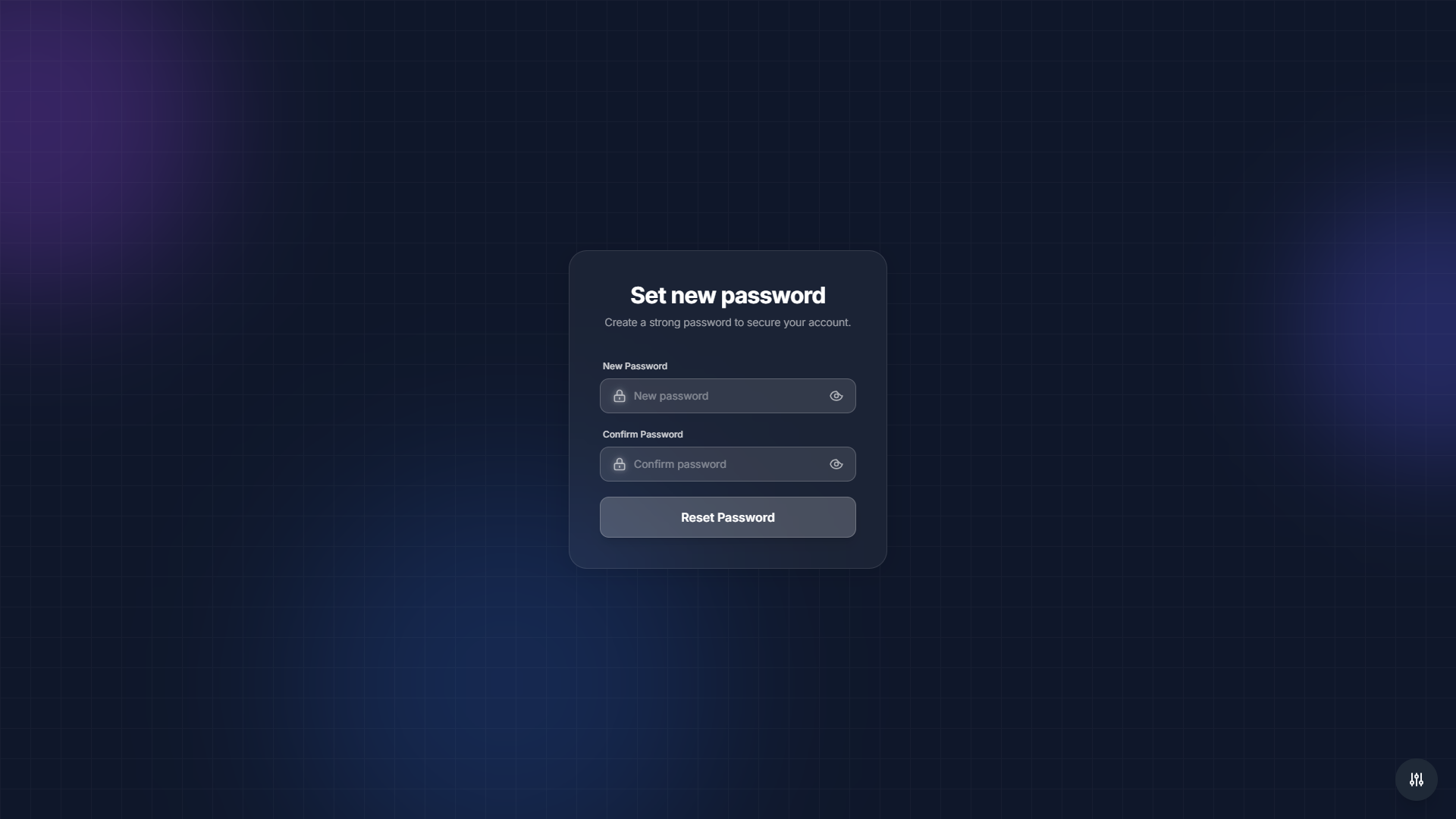
- Mobile-First Theme: Mobile-optimized design with app-like interface, perfect for mobile applications and progressive web apps
6 Complete Authentication Flows
All essential authentication states are covered:
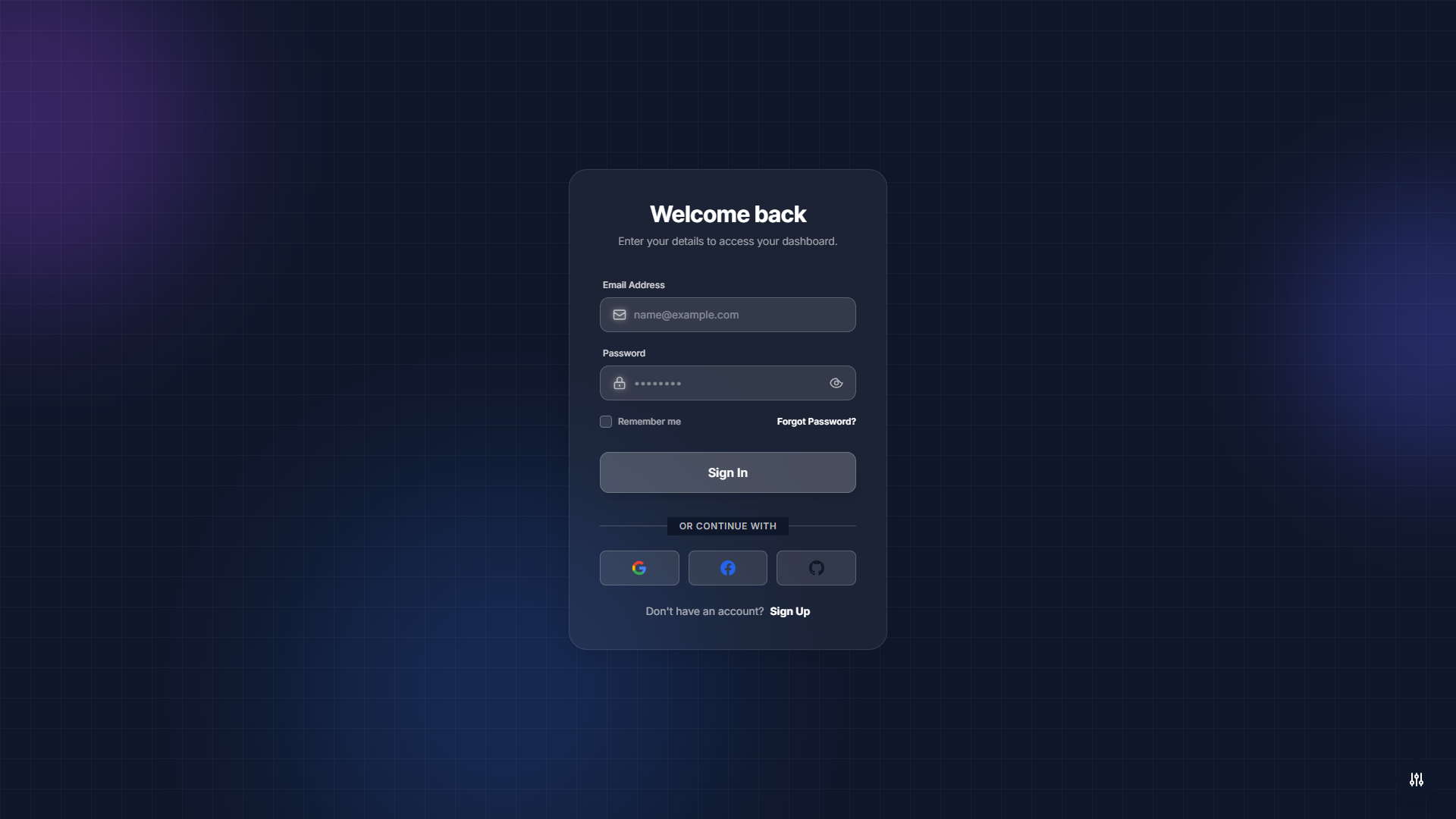
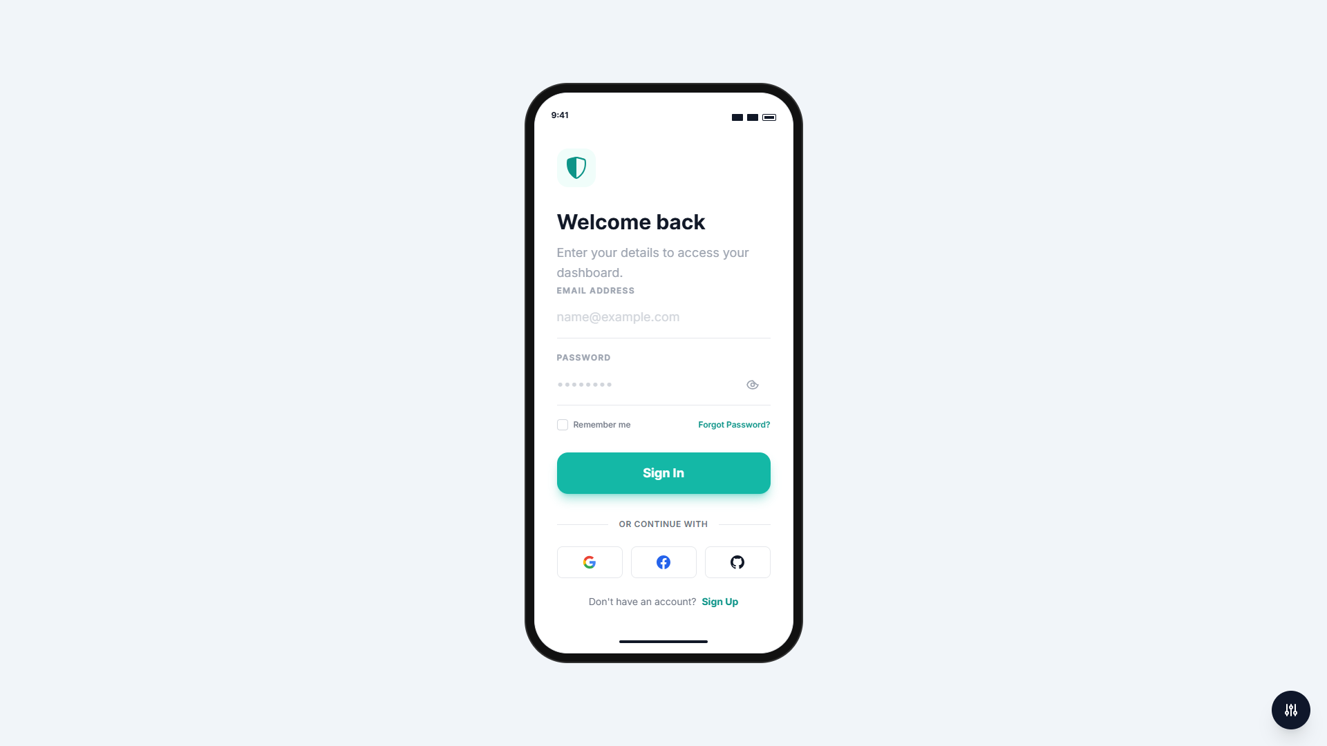
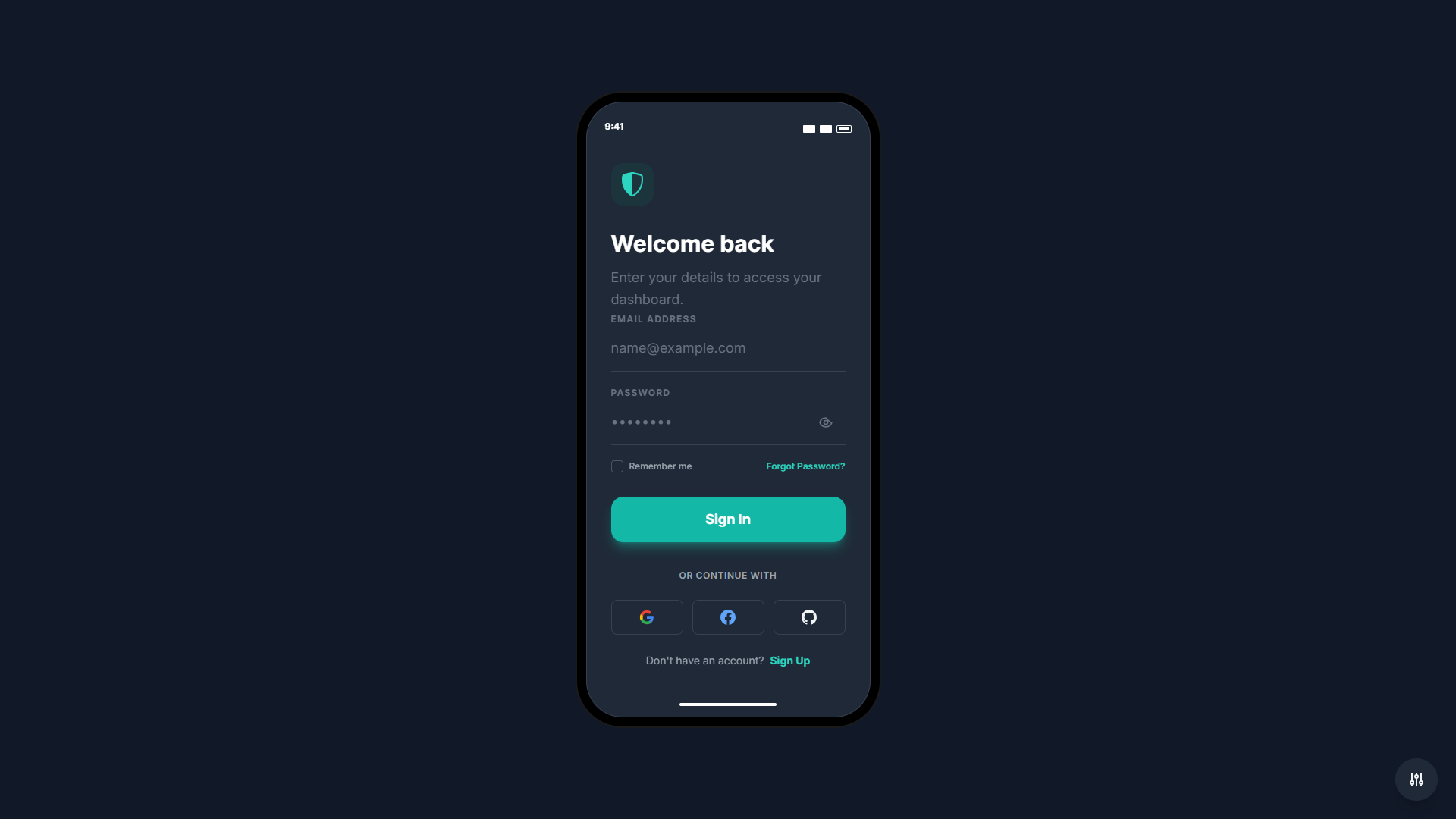
- Sign In: Standard login form with email, password, remember me functionality, and social login options
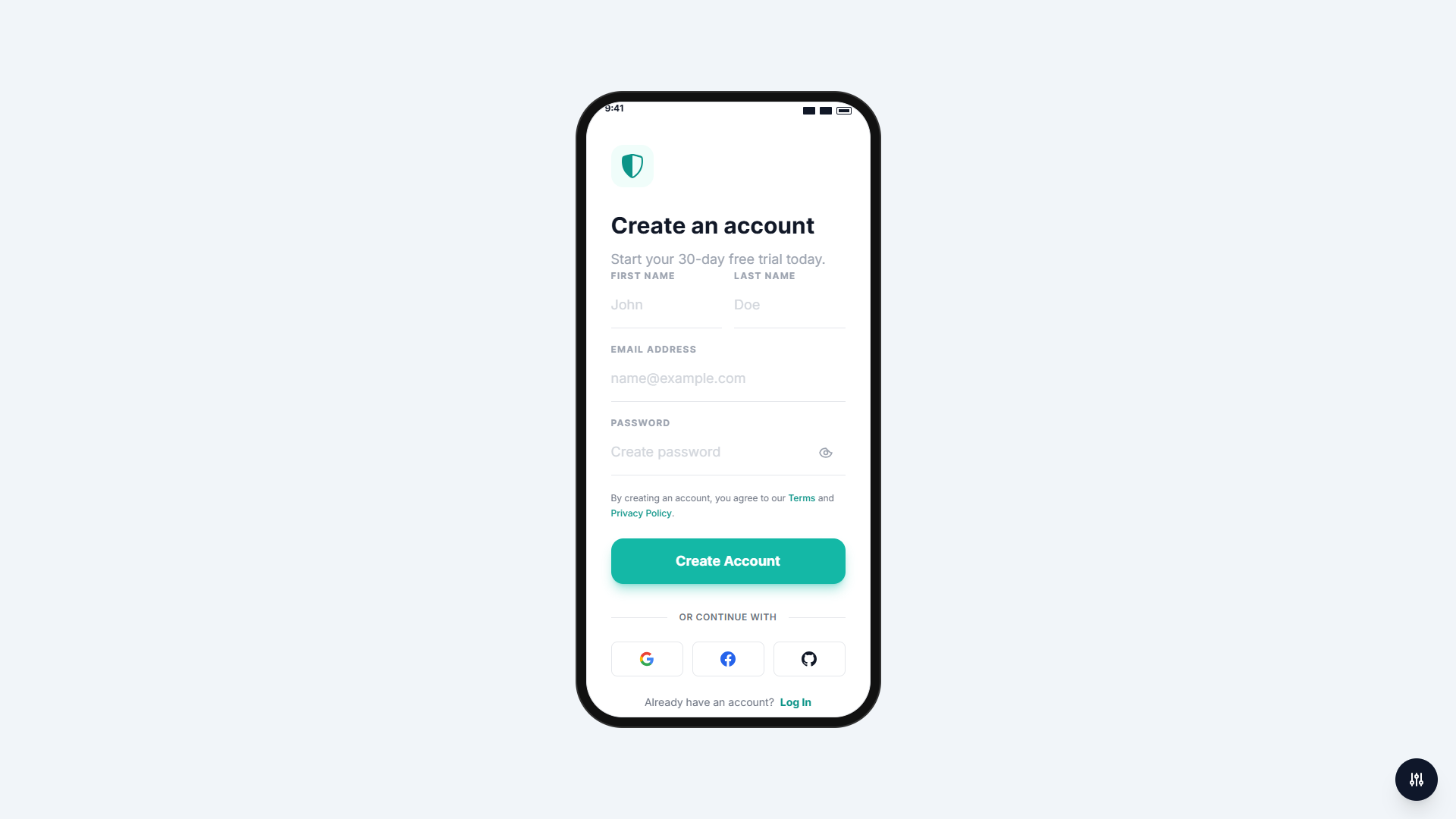
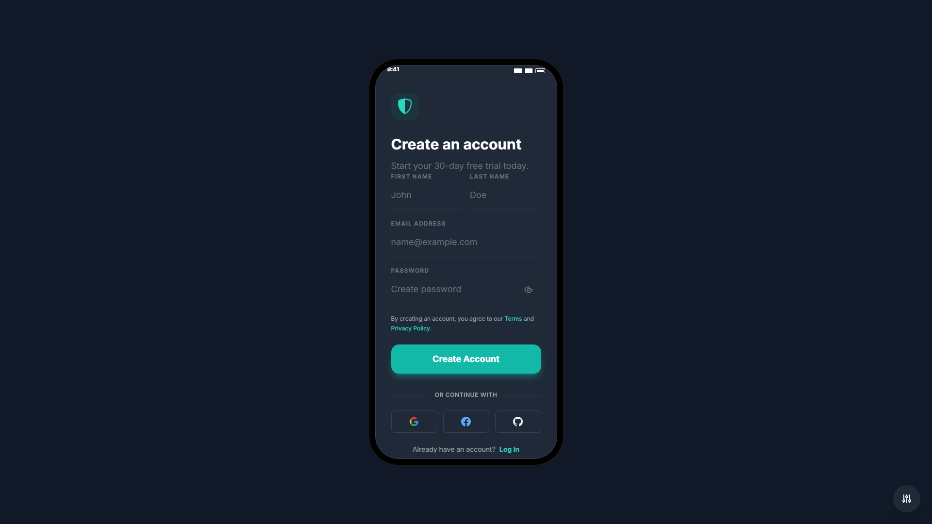
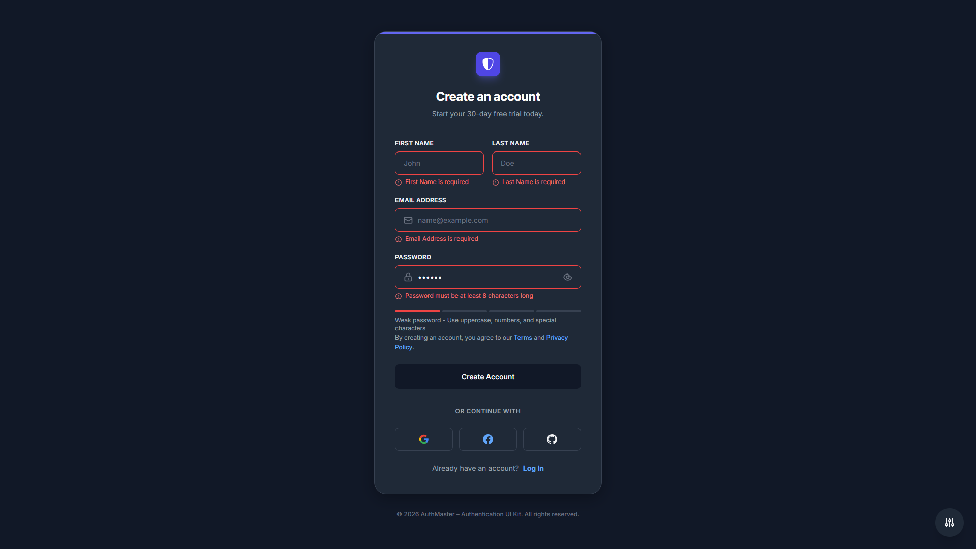
- Sign Up: Registration form with first name, last name, email, password strength meter, and social login integration
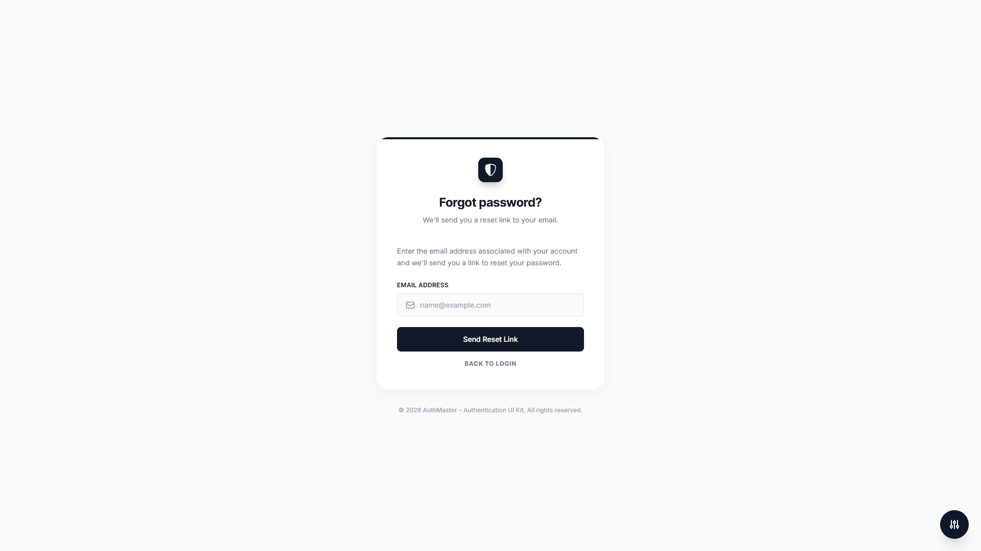
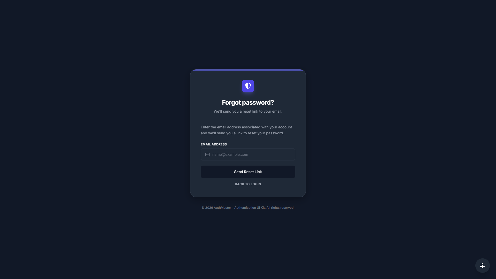
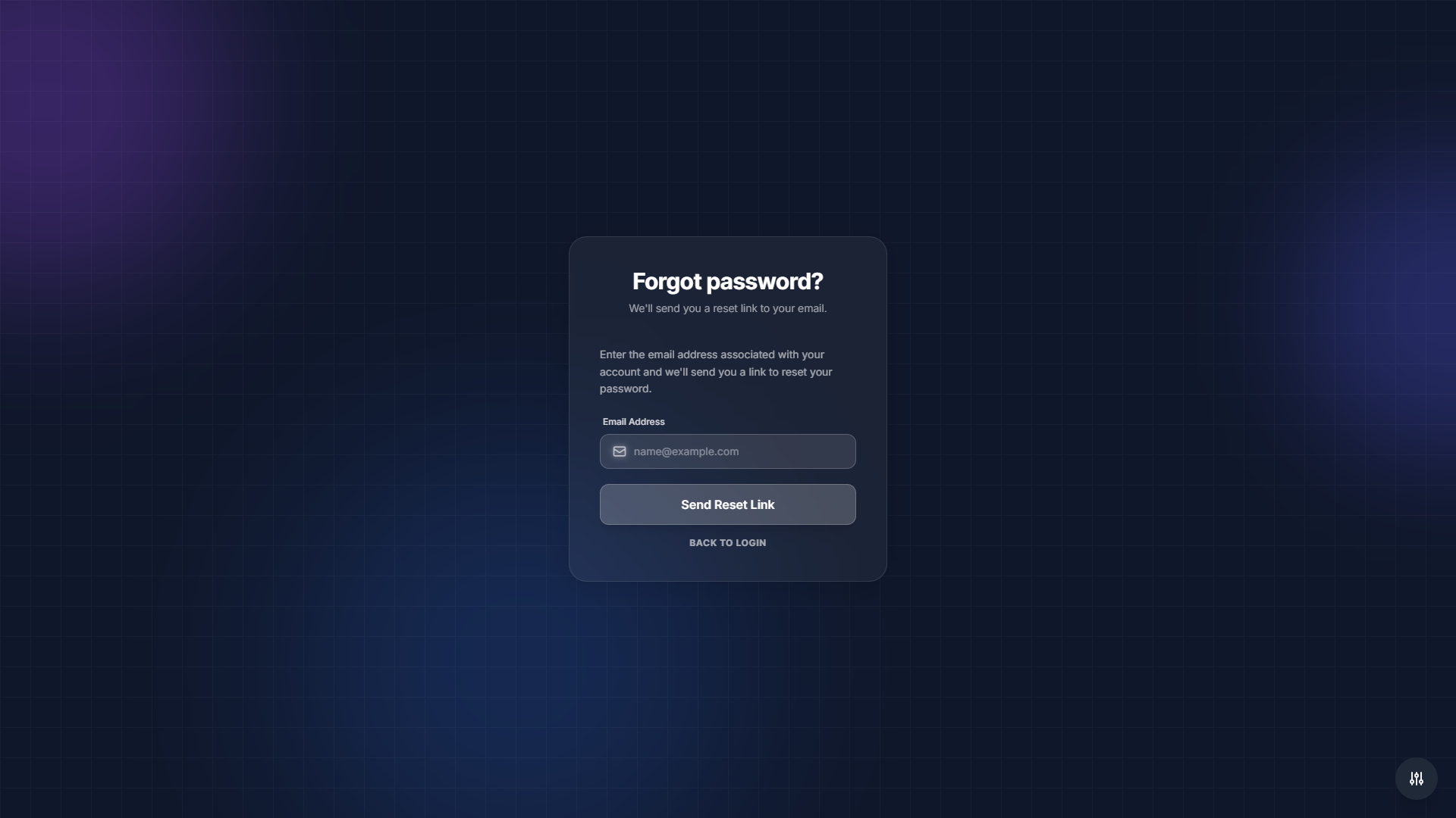
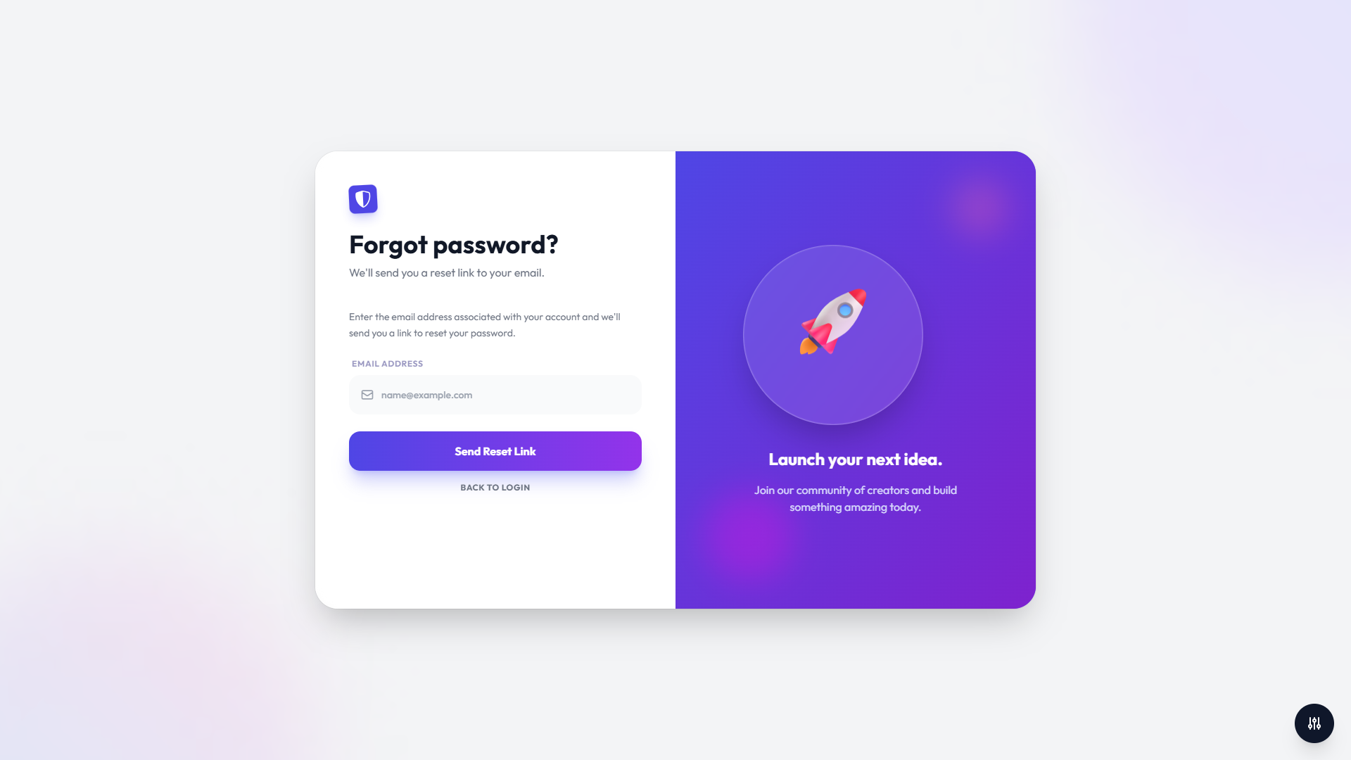
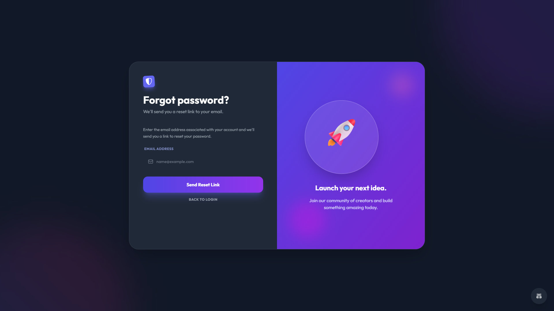
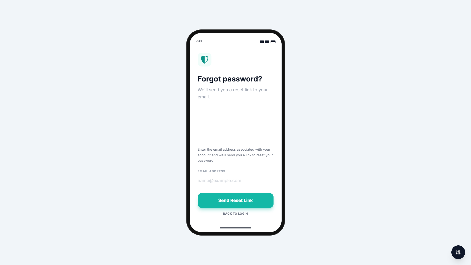
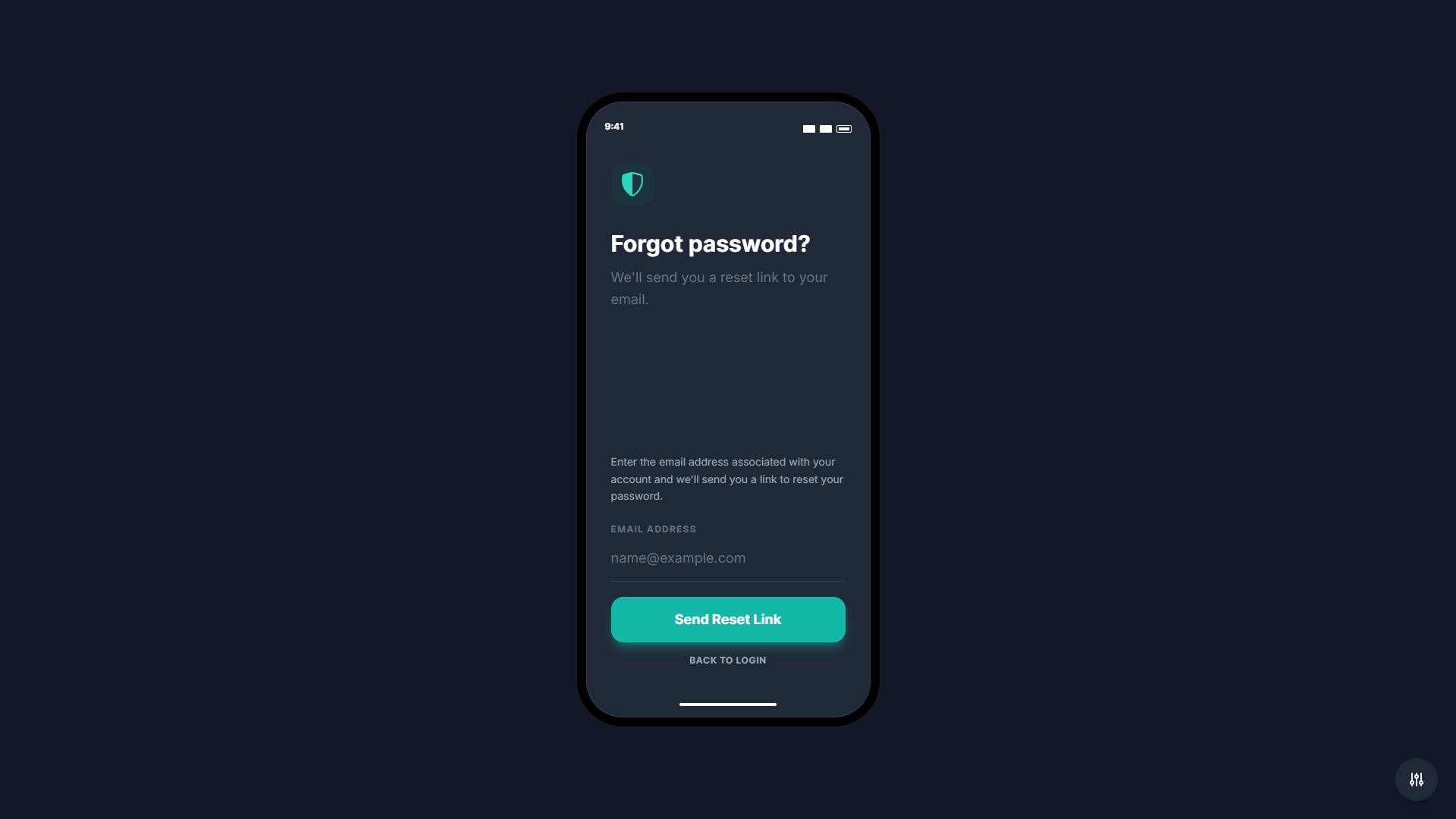
- Forgot Password: Password recovery form for resetting user passwords
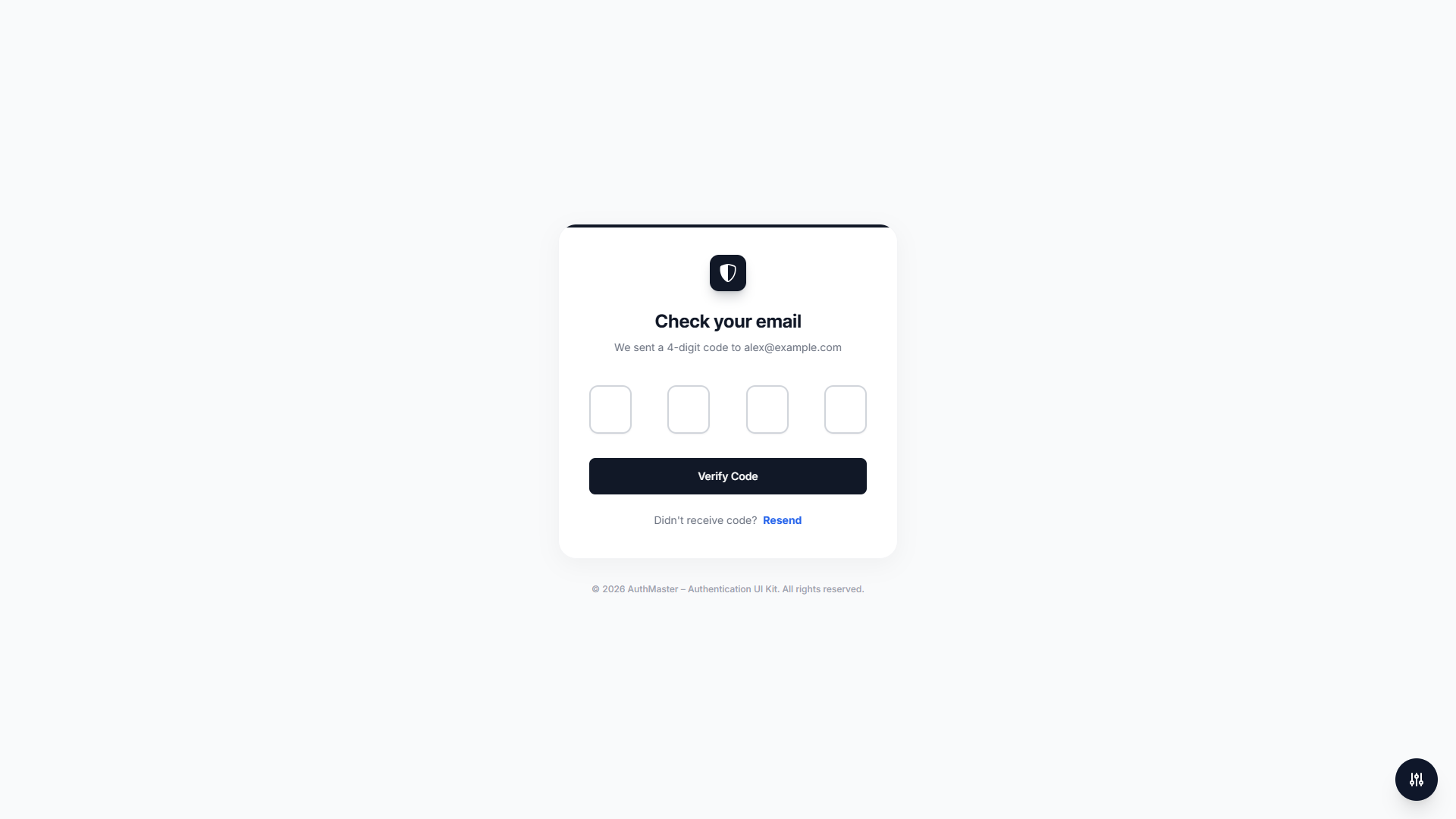
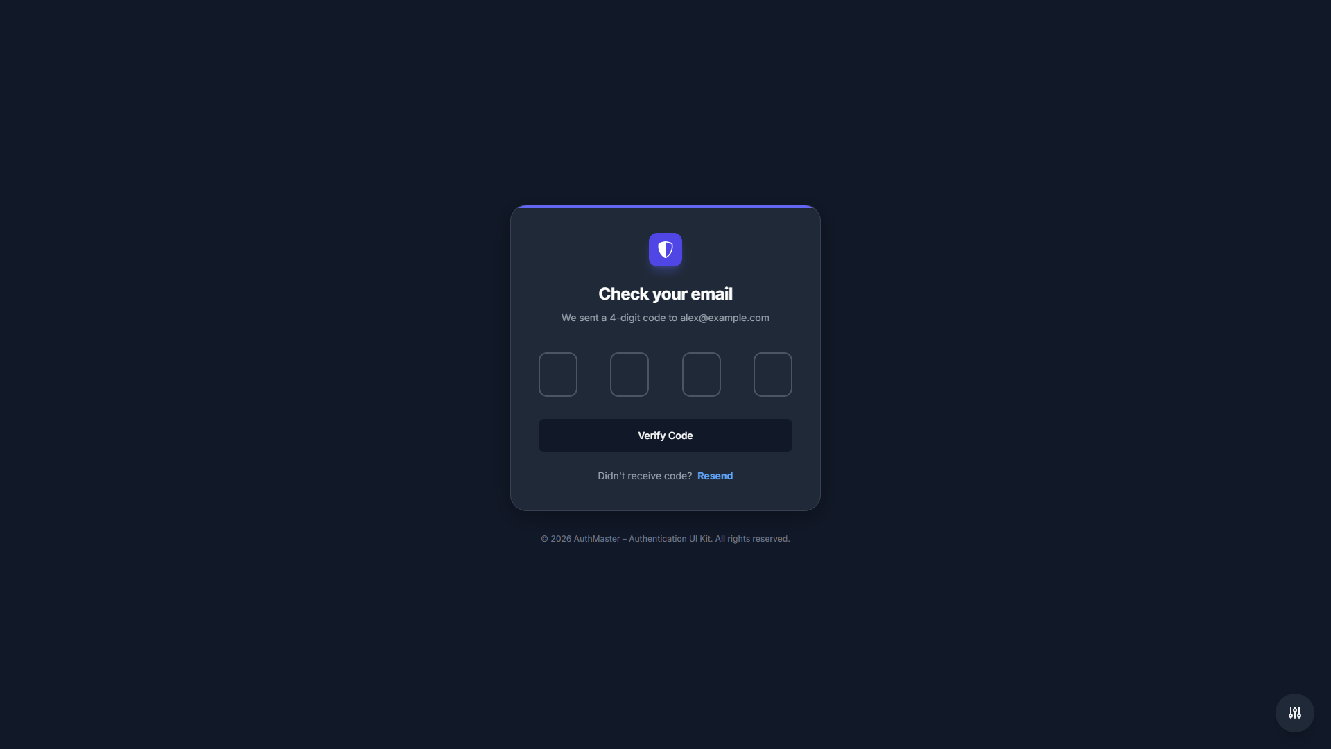
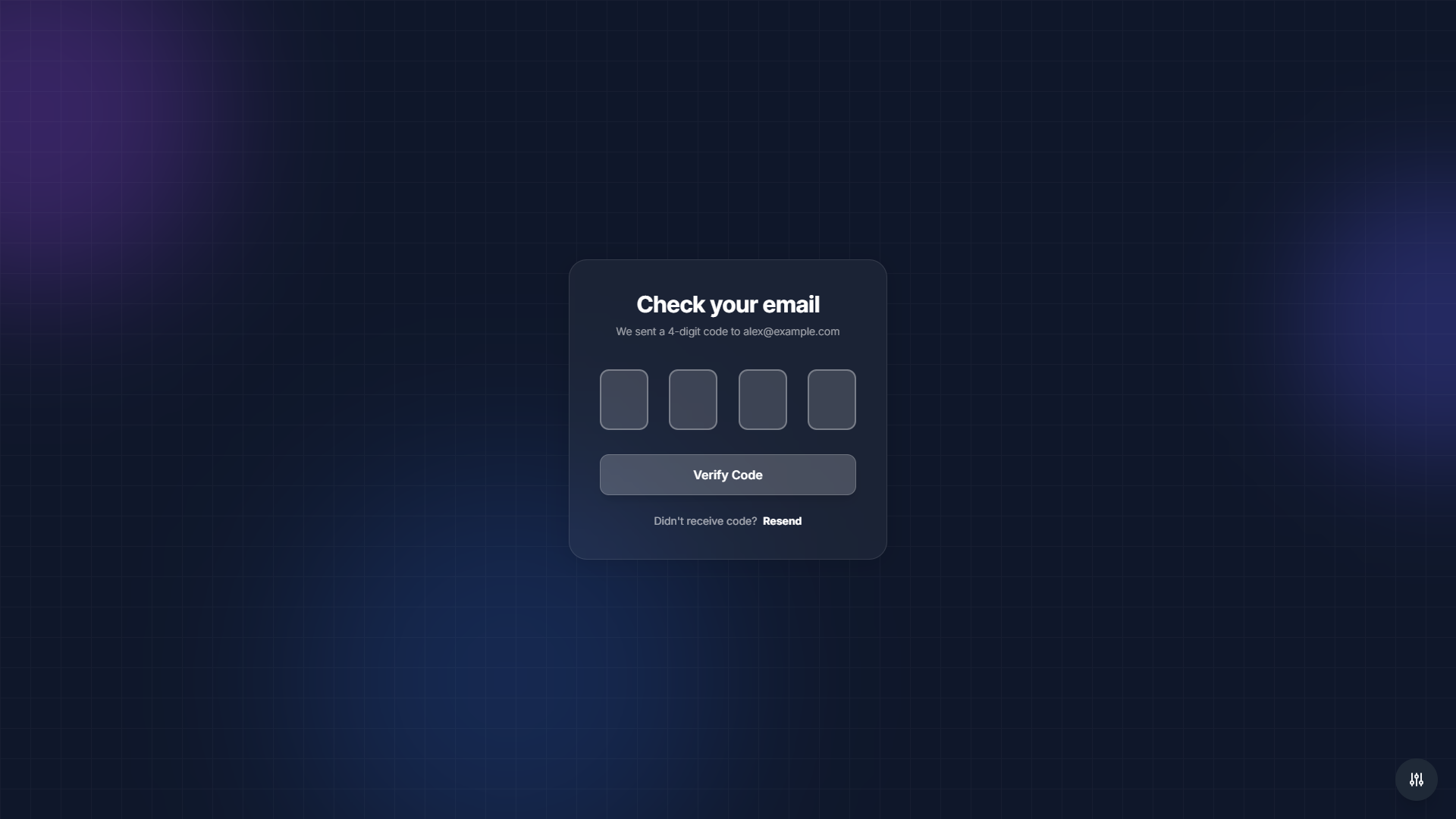
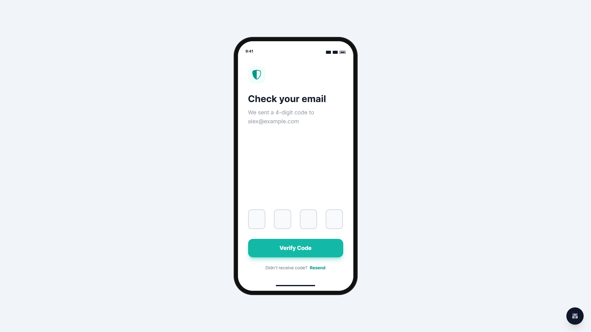
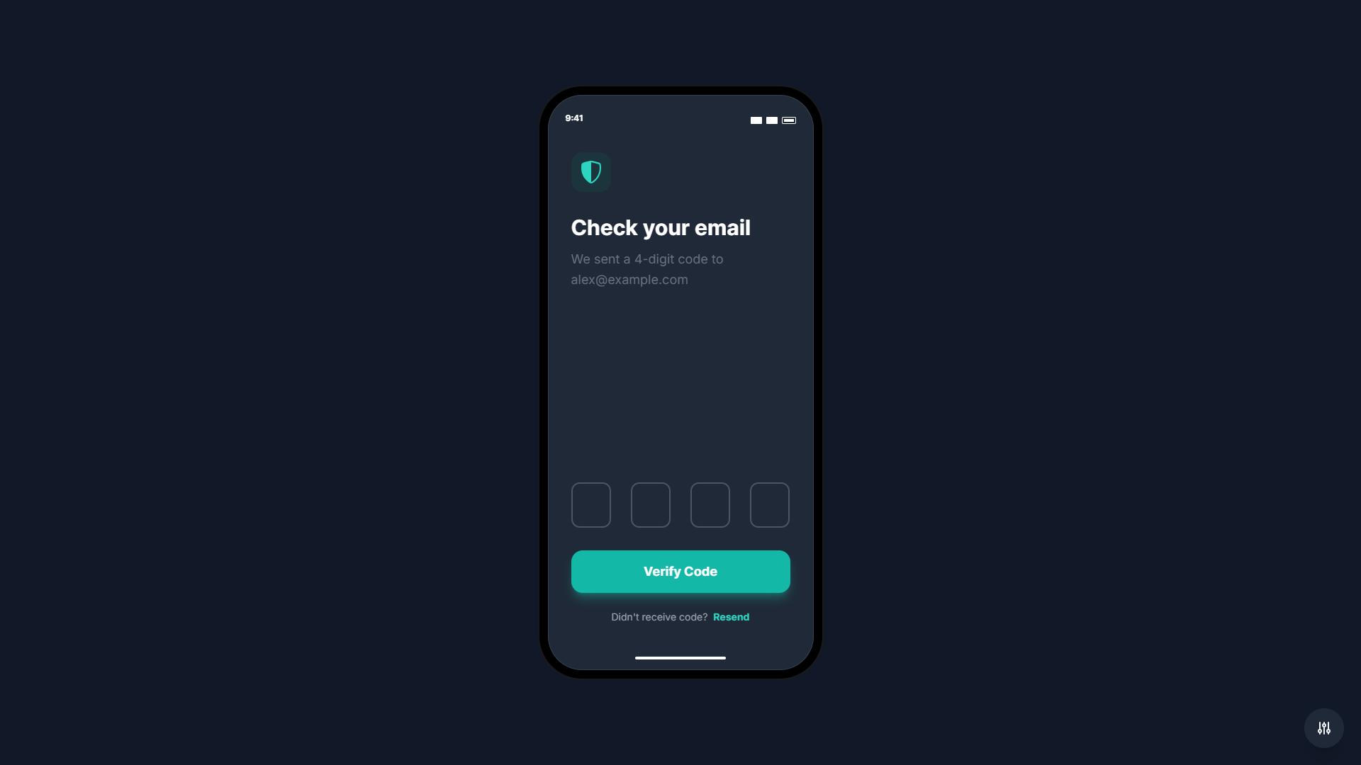
- OTP Verification: 4-digit code verification for email verification
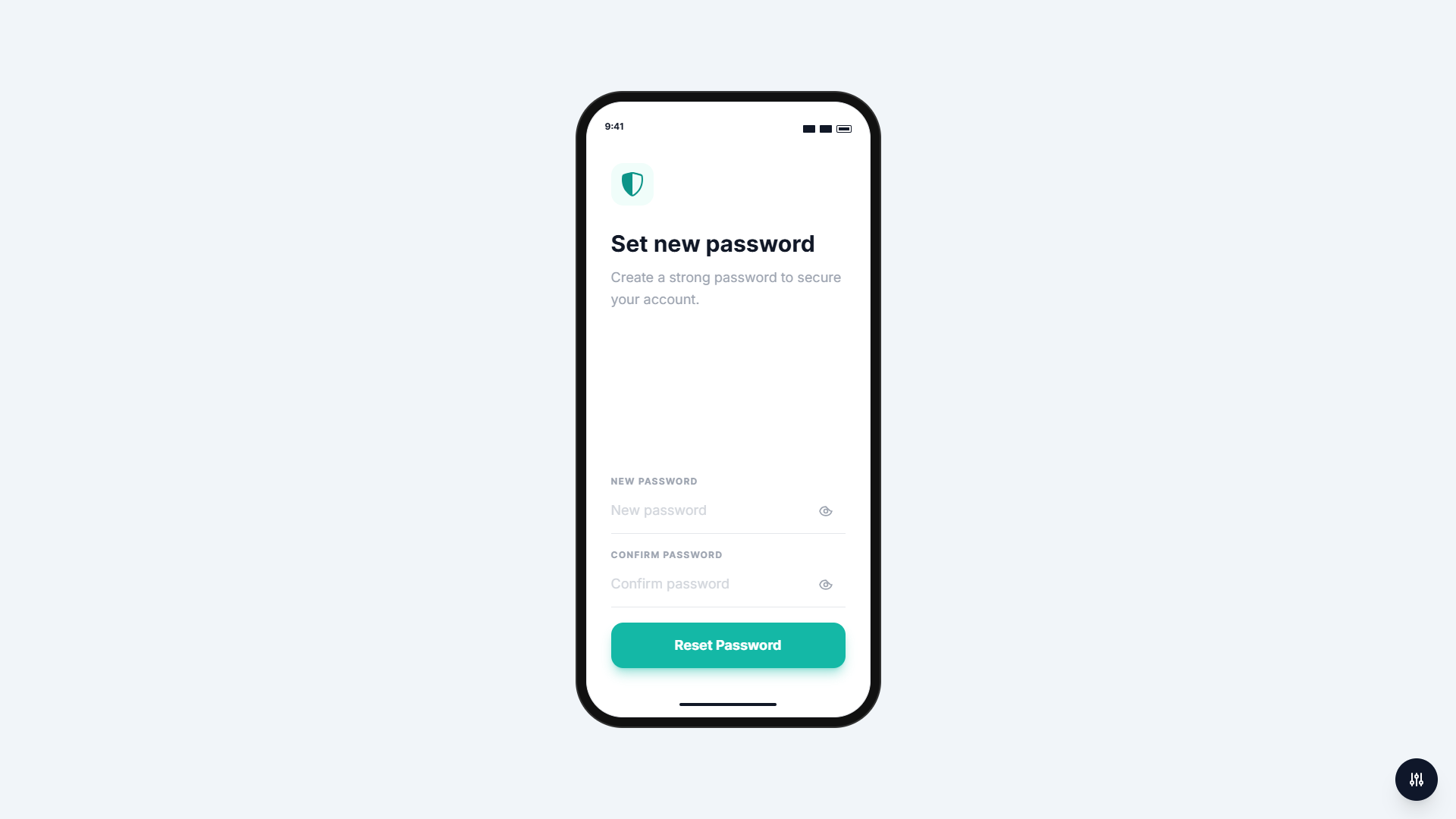
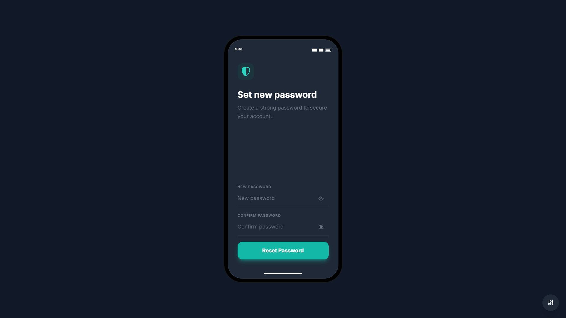
- Reset Password: New password creation form with confirmation field
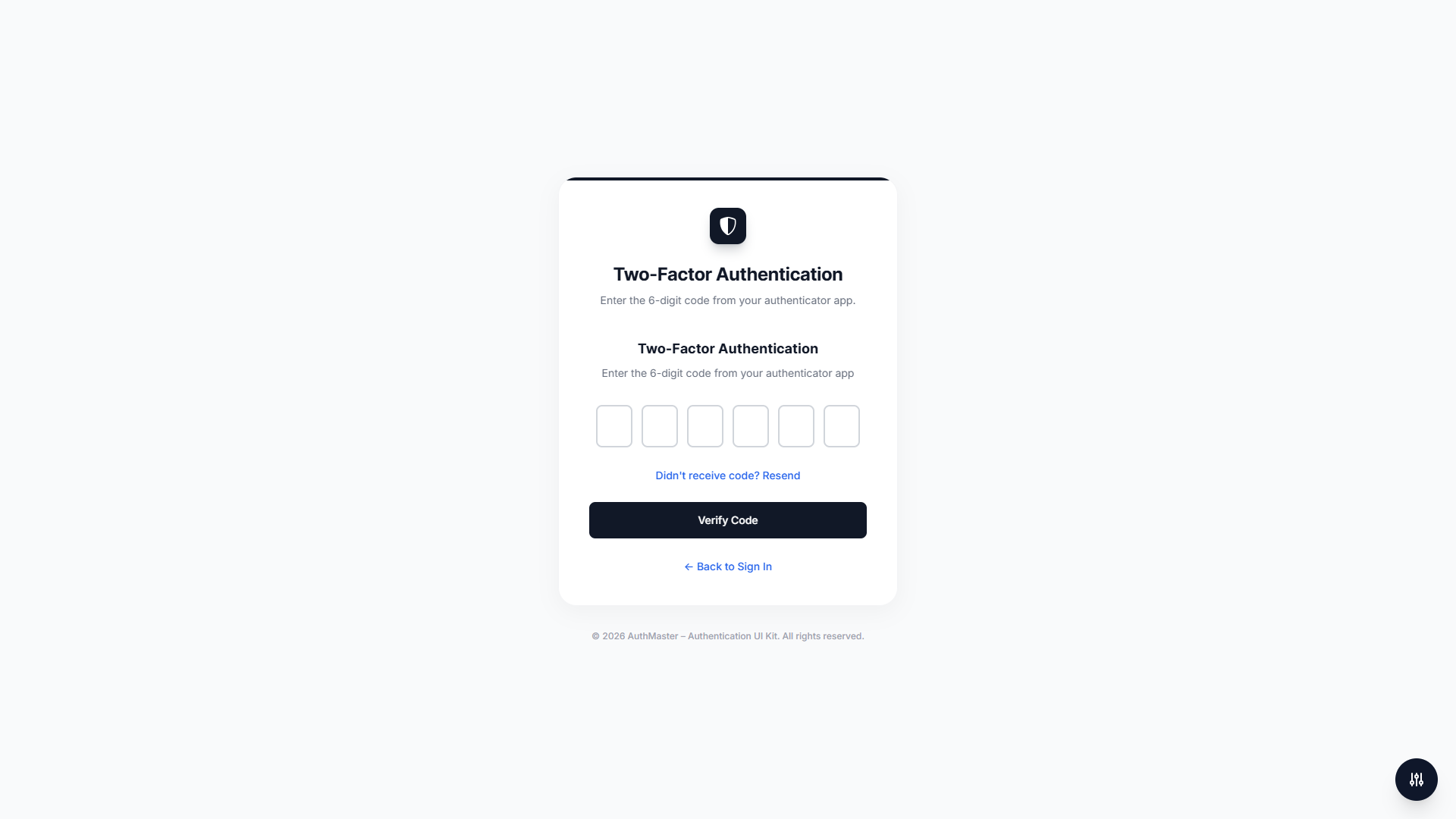
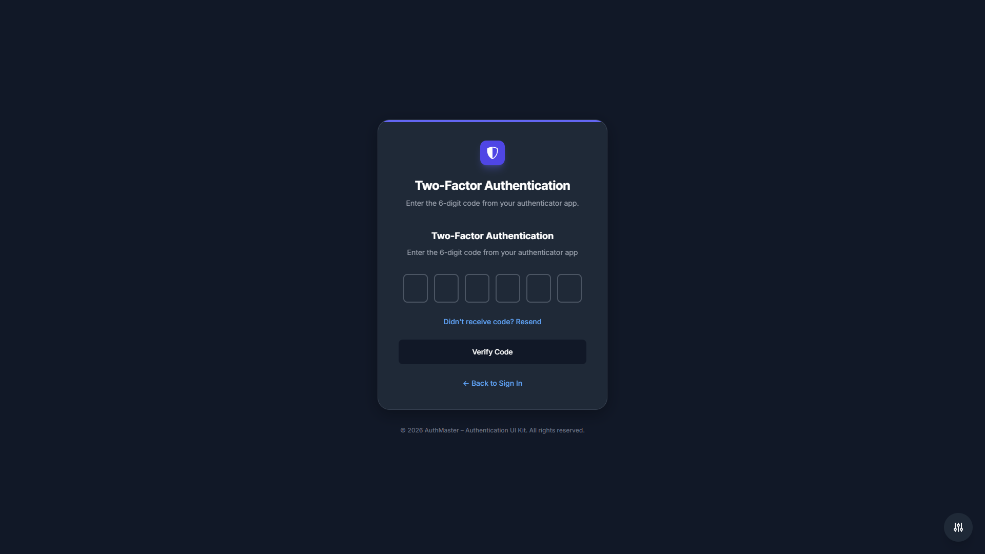
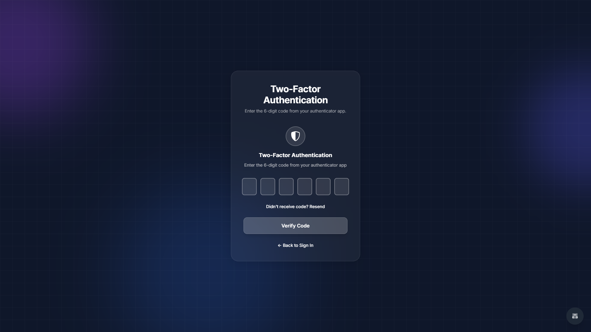
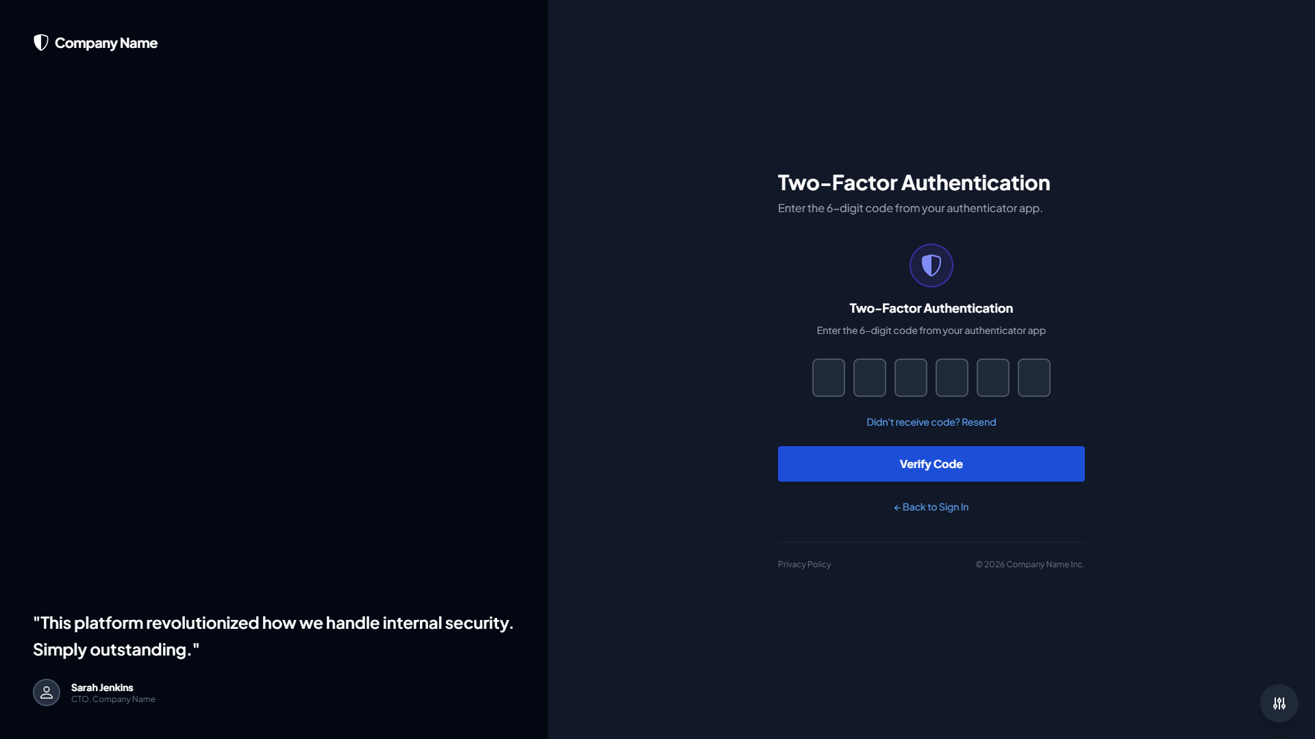
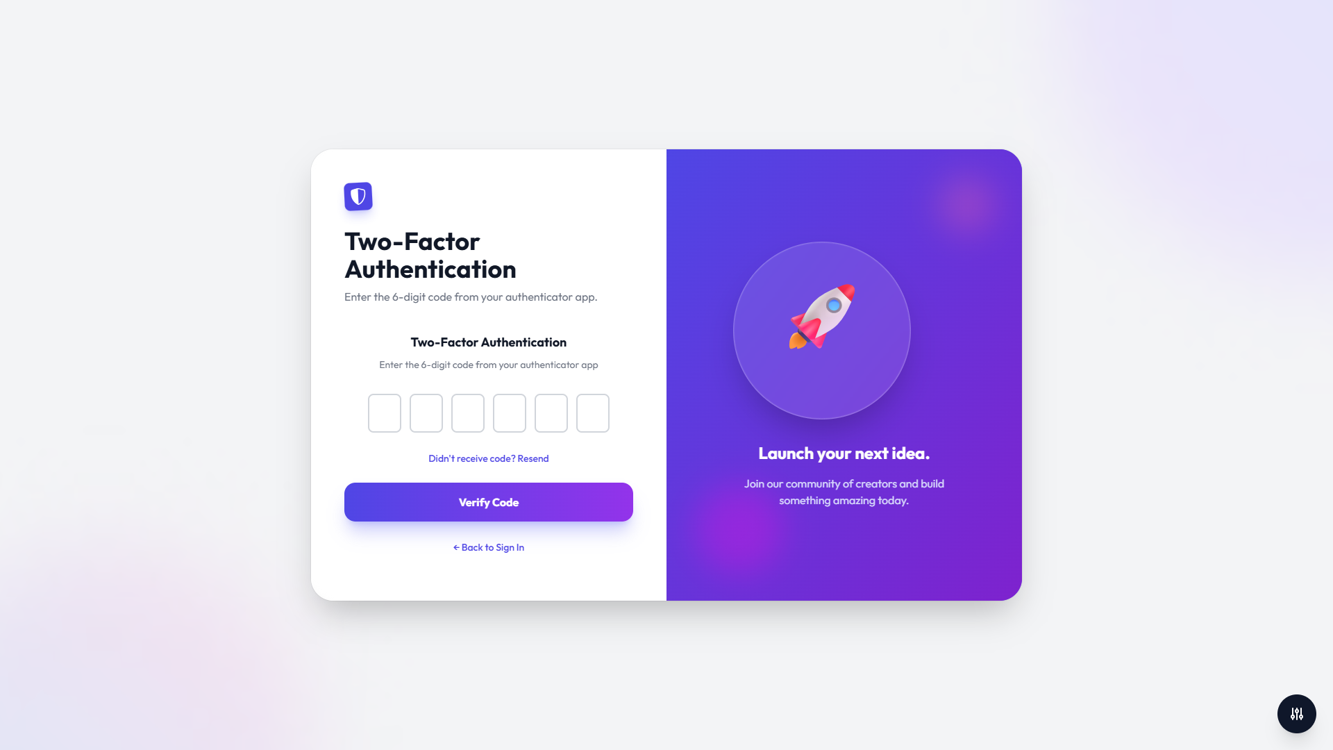
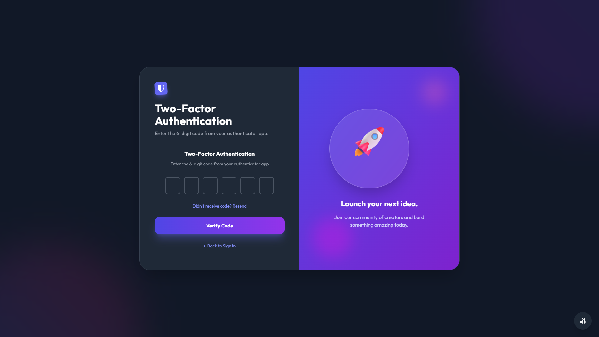
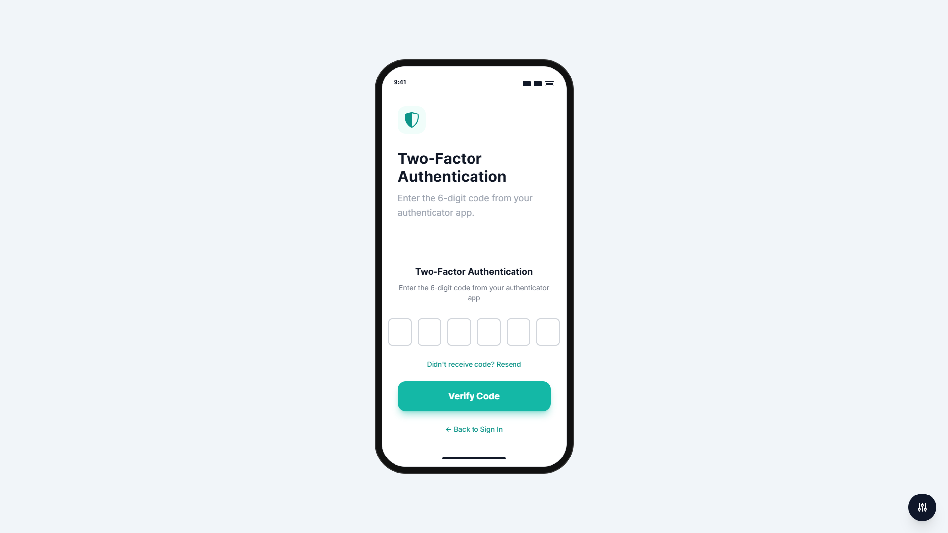
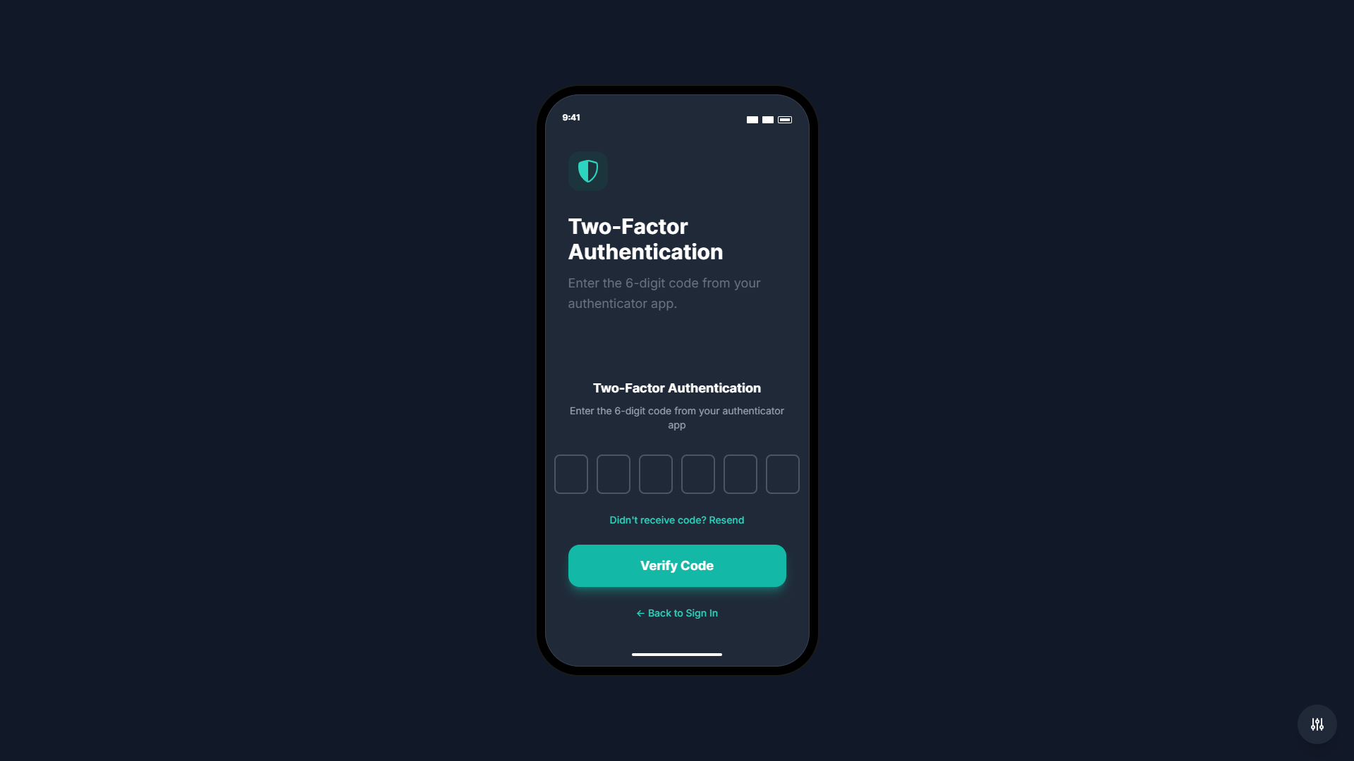
- Two-Factor Authentication (2FA): Complete 6-digit code verification flow with auto-focus, paste support, and keyboard navigation
Social Login Integration
Ready-to-use UI components for OAuth integration with Google, Facebook, and GitHub. The buttons are fully styled and theme-aware, ready for backend OAuth implementation.
Password Strength Meter
Real-time visual password strength indicator with 4-bar display showing weak, fair, good, and strong password levels. Includes descriptive text feedback to help users create stronger passwords.
Form Validation System
Comprehensive JavaScript validation system with real-time feedback, accessible error messages, and theme-aware styling. Validates email format, password requirements, text fields, and OTP inputs with customizable rules.
Loading States and UX Enhancements
Professional loading spinners and disabled states during form submission. Toast notification system replaces browser alerts with modern, non-intrusive notifications for success, error, info, and warning messages.
Remember Me Functionality
Persistent email storage with localStorage support. Automatically loads saved email addresses on return visits when remember me is checked.
Dark Mode Support
Full dark mode support with three options: System (follows OS preference), Light mode, and Dark mode. All themes support dark mode with proper contrast and styling. User preference is automatically saved and persists across sessions.
Fully Responsive Design
Mobile-first approach ensures optimal experience across all devices. Works seamlessly on smartphones, tablets, and desktops with touch-friendly interactions and adaptive layouts.
Accessibility (WCAG 2.1 AA Compliant)
Built with accessibility in mind:
- ARIA labels and roles throughout
- Keyboard navigation support
- Screen reader support
- Skip to content links
- Proper form associations
- Reduced motion support
- Semantic HTML structure
Zero External Dependencies
All assets are included locally – no external CDN dependencies. Tailwind CSS, fonts (Inter, Outfit, Plus Jakarta Sans), and all icons are bundled with the kit. Works offline and ensures fast loading times.
Modular Architecture
Clean, organized code structure following best practices:
- Separated components, themes, and core modules
- Centralized configuration system
- Easy to customize and extend
- Production-ready code
- Well-documented with inline comments
Technical Details
Built With
- Vanilla JavaScript (ES6+) – No framework dependencies
- Tailwind CSS – Utility-first CSS framework (included locally)
- HTML5 – Semantic markup
- CSS3 – Modern styling with animations
Browser Support
Compatible with all modern browsers:
- Chrome (latest)
- Firefox (latest)
- Safari (latest)
- Edge (latest)
File Structure
Well-organized folder structure following Envato marketplace standards:
- Modular JavaScript components
- Separated theme layouts
- Core modules for state management and rendering
- Comprehensive documentation
- Local fonts and assets
Documentation
Comprehensive documentation is included:
- README.md: Quick start guide and feature overview
- INSTALLATION.md: Detailed installation and deployment instructions with security considerations
- CUSTOMIZATION.md: Extensive customization guide covering all aspects of the kit
- STRUCTURE.md: Complete file structure documentation
- documentation.html: Interactive HTML documentation with full API reference
- CHANGELOG.md: Version history and release notes
Security Considerations
This UI kit handles client-side validation and UI only. Comprehensive security documentation is provided, including:
- Backend validation requirements
- CSRF protection guidance
- Rate limiting recommendations
- Password hashing best practices
- Session management guidelines
- OAuth integration guide
Customization
Easy customization through centralized configuration:
- Change default theme and flow
- Customize colors and branding
- Modify text content and messages
- Add company logos (Corporate theme)
- Adjust validation rules
- Configure API endpoints
Use Cases
Perfect for:
- Web developers building authentication systems
- Agencies creating client projects
- Startups needing quick auth UI implementation
- Developers wanting customizable authentication flows
- Projects requiring multiple theme options
- Applications needing accessible authentication interfaces
What’s Included
- 5 premium theme layouts
- 6 complete authentication forms
- Social login UI components
- Password strength meter
- Form validation system
- Toast notification system
- Loading state components
- Dark mode implementation
- Comprehensive documentation
- 57 high-quality screenshots
- Source files with clean, commented code
Credits
This product uses the following open-source resources:
- Tailwind CSS: Utility-first CSS framework by Tailwind Labs (MIT License)
- Inter Font: Designed by Rasmus Andersson (SIL Open Font License)
- Outfit Font: Designed by Rodrigo Fuenzalida (SIL Open Font License)
- Plus Jakarta Sans Font: Designed by Tokotype (SIL Open Font License)
- Bootstrap Icons: Icon library by Bootstrap team (MIT License)
Support
For support, updates, and questions, please contact the author through CodeCanyon. The product includes comprehensive documentation to help you get started quickly.


