

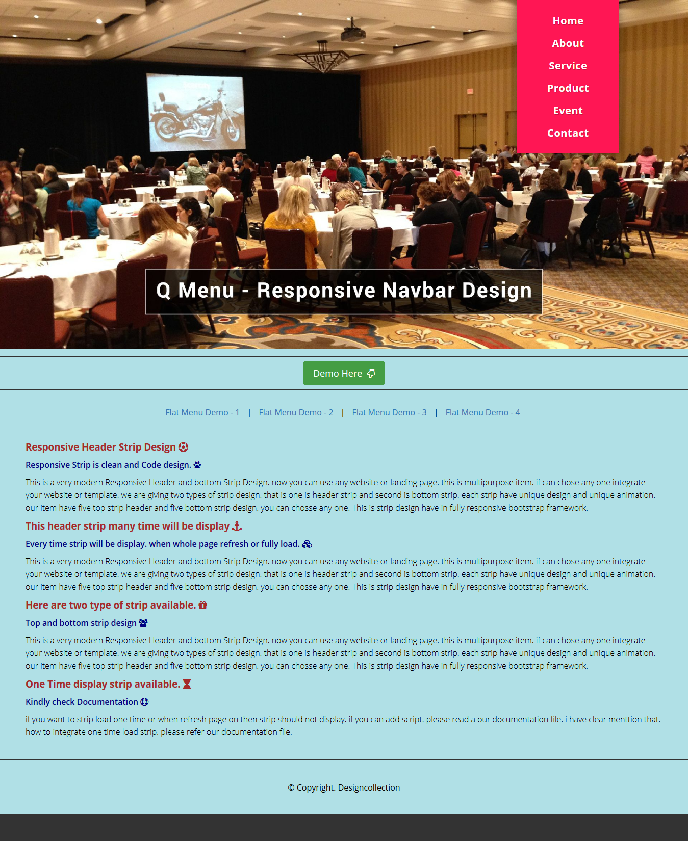
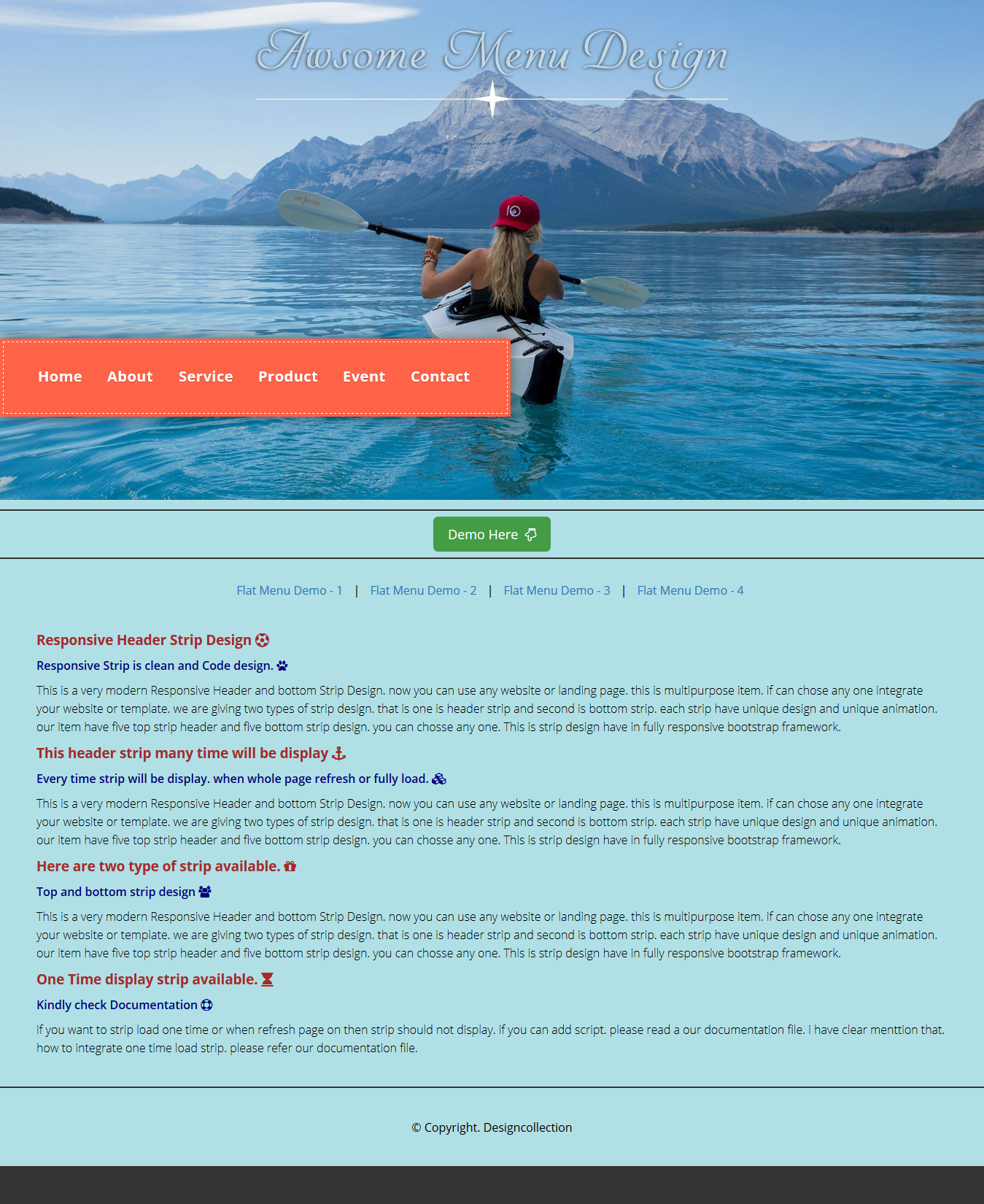
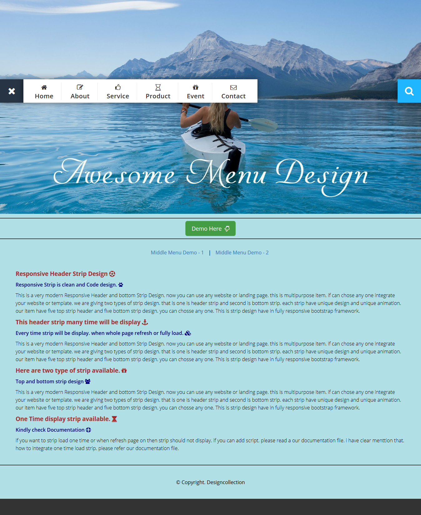
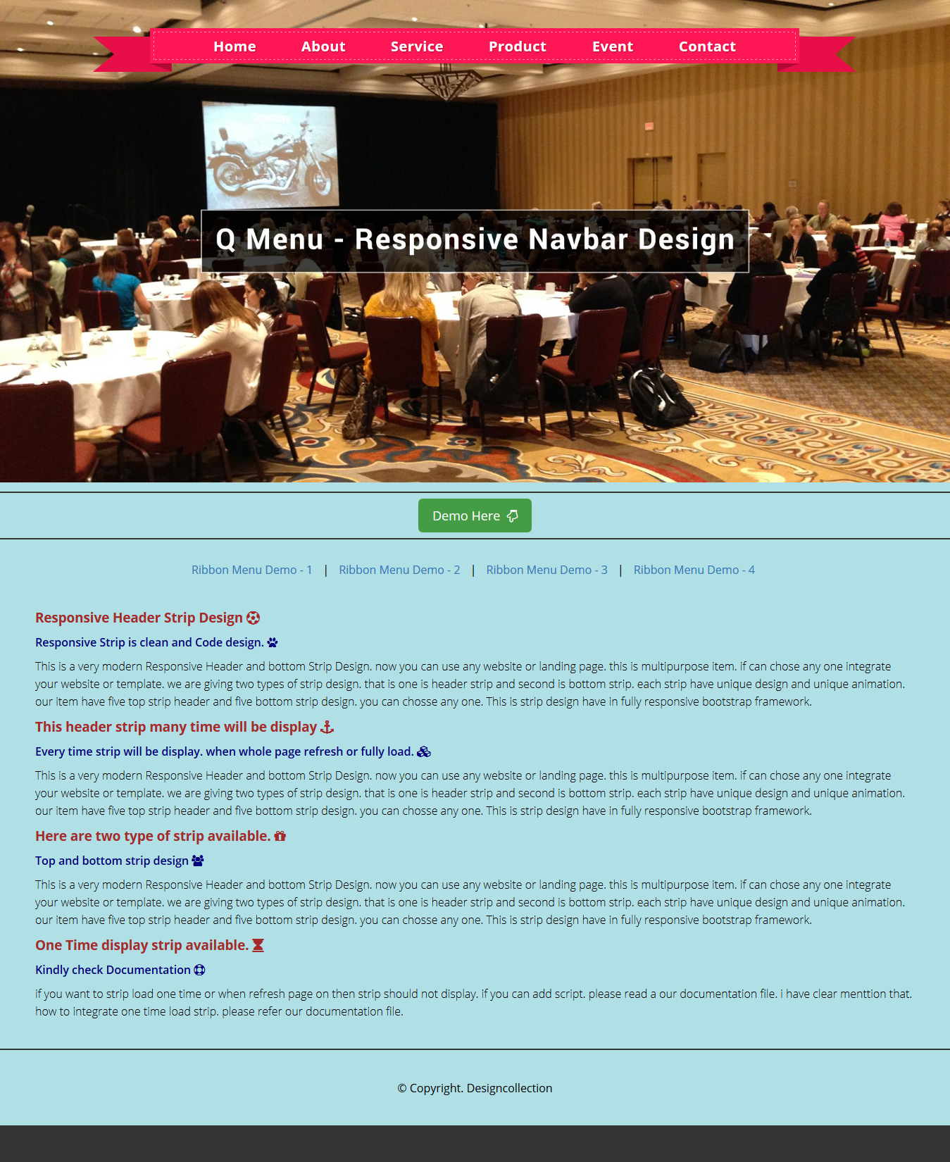
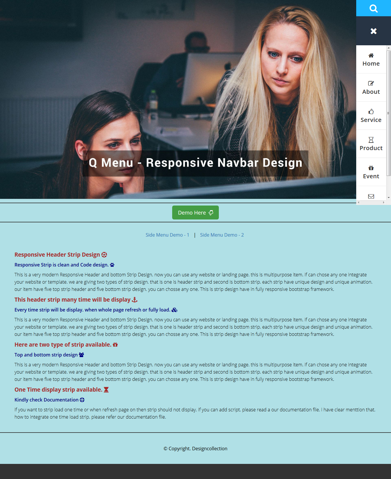
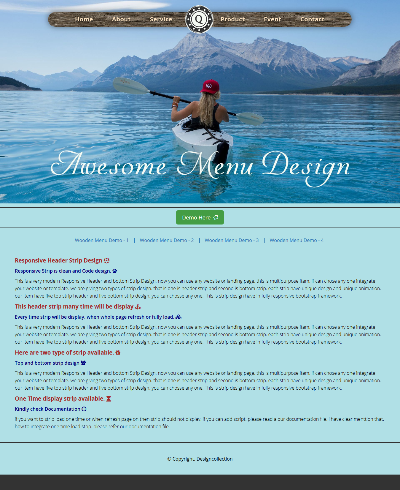
The Slick – Responsive Navbar Design is a professional CSS2 & CSS3 jQuery Slick – Responsive Navbar Design item compatible with any framework, website and template. This Navbar comes with horizontal and Vertical version and 8 different design with each 2 to 3 types of layout.
Responsive Navbar Design is a flexible and high customizable to build your custom Responsive Navbar Code. It is very easy to build a vertical & horizontal menu.
Slick – Responsive Navbar Design component based in CSS and Javascript code. You can use Navbar Navigation it as a horizontal & vertical Navigation. It is a Responsive Navigation, suitable for any type of website and Template or landing page.
Features
- - 100% Responsive Design
- - 3 Types of Menu Layout
- - Best Google Web Font Use
- - 8 Different Menu Design
- - Good Animation/Gradient Effect
- - Documentation included
- - Clean Design and Code
- - Easy to Customize
- - Easy to use
Live Demo URL: Click here
Sources and Credits
I’ve used the following: Thanks so much to
Font: Google Web Fonts
jQuery: Javascript
Fontawsome icon: Free Font Awesome, the iconic font
Images Source: Pixbay.com
Support Facilities
If you have any questions related to this item. Please email us your before purchase product questions, installation request, customization project, and any other queries to here. Email: support@designcollection.in
Best wishesDesign Collection
