

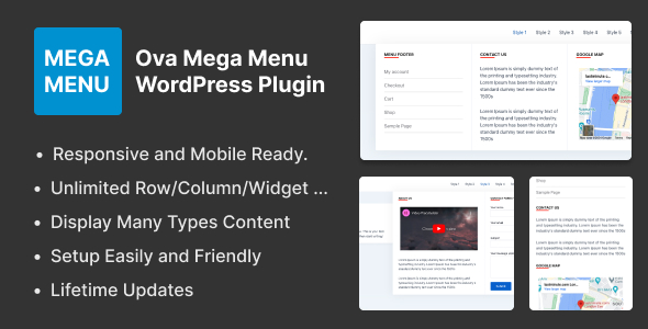
Ova Mega Menu – Drag & Drop Responsive Mega Menu Builder for WordPress
Ova Mega Menu is a powerful, lightweight WordPress plugin that lets you build beautiful, fully responsive mega menus with a visual drag & drop builder. Create multi-column dropdowns, attach them to any menu item, and design completely different layouts for desktop, tablet, and mobile – all without touching a single line of code.
Check Backend with Account:
https://demo.ovathemewp.com/megamenu/wp-admin
Username: demo
Password: demo
Problems It Solves
- Cramped, hard-to-use navigation. Default WordPress menus can only show a plain list of links. Ova Mega Menu turns crowded navigation into clear, organized multi-column panels that visitors can scan in seconds.
- No control on mobile. Most menus look great on desktop but break on smaller screens. Here you design a separate layout for desktop, tablet, and mobile, so the menu is perfect on every device.
- Coding required for advanced menus. Building a mega menu usually means custom HTML and CSS. Our visual builder with resizable rows and columns removes the need for any development work.
- Rigid content options. Standard menus only hold links. With Ova Mega Menu you can drop in text, headings, shortcodes, existing WordPress menus, and even full Elementor templates.
Who Is This Plugin For?
Ova Mega Menu is built for WordPress site owners, bloggers, agencies, freelancers, and theme developers who want professional navigation without hiring a developer. It is ideal for online stores, magazines, corporate sites, portfolios, directories, and any website with a large amount of content that needs clean, structured menus.
Key Benefits
- Save hours of development time. The drag & drop builder lets you assemble rows, columns, and content blocks visually. What used to take a developer hours can now be done in minutes, directly from the WordPress dashboard.
- Deliver a flawless experience on every screen. Because you design desktop, tablet, and mobile independently with custom breakpoints, your navigation always looks intentional – never squeezed or broken on smaller devices.
- Full design freedom without code. Control width, position, padding, background, borders, radius, box shadow, and typography from simple settings panels, and add your own custom CSS whenever you need finer control.
- Keep your site fast and clean. The plugin generates optimized CSS and can output styles to an external file, so your mega menus look rich while keeping page load light.
How It Works
- Step 1 – Create a mega menu. Add a new Mega Menu from the dedicated admin panel and choose full-width or container layout.
- Step 2 – Build your layout. Add rows, split them into resizable columns, and drop in your content: text, headings, shortcodes, menus, or Elementor templates.
- Step 3 – Design for each device. Switch between the Desktop, Tablet, and Mobile tabs to fine-tune the layout for every breakpoint.
- Step 4 – Attach and publish. Copy the generated shortcode into any WordPress menu item, save, and your mega menu goes live instantly.
Main Features
- Visual drag & drop mega menu builder
- Resizable rows and columns with percentage-based widths
- Separate layouts for Desktop, Tablet, and Mobile
- Custom responsive breakpoints for each device
- Full-width or container display styles
- Content widgets: Text (WYSIWYG editor), Heading, Shortcode, and Menu
- Insert existing WordPress navigation menus or add custom menu items
- Elementor template support inside the mega menu
- Attach any mega menu to any menu item via shortcode
- Global styling: position, z-index, padding, background color, border, border radius, and box shadow
- Element-level styling for rows, columns, widgets, headings, and menu items
- Google Fonts support
- Custom CSS editor with internal or external CSS output
- Choose menu open/close on hover or click
- Translation ready and RTL friendly
- Lightweight, clean, and well-documented code
Use Cases
- E-commerce stores – showcase product categories, featured items, and promotions in an organized dropdown.
- Magazines & blogs – group articles by topic and highlight featured content directly in the menu.
- Corporate & business sites – present services, solutions, and contact details clearly.
- Portfolios & agencies – feature projects and calls to action inside a rich navigation panel.
- Directories & large sites – make hundreds of links accessible through clean, multi-column structures.
Why Choose Ova Mega Menu?
- Truly responsive. Unlike menus that simply shrink, Ova Mega Menu gives you independent control of desktop, tablet, and mobile layouts for a purpose-built experience on each device.
- No coding needed. The intuitive drag & drop builder means anyone can create professional mega menus, while developers still get custom CSS and shortcode flexibility.
- Works with your favorite tools. Compatible with any well-coded WordPress theme and with Elementor, shortcodes, and standard WordPress menus.
- Built for performance. Clean, optimized code and external CSS output keep your site fast, secure, and easy to maintain.
Frequently Asked Questions
Do I need coding skills to use this plugin?
No. Everything is built through a visual drag & drop interface inside the WordPress dashboard. Developers who want extra control can still add custom CSS.
Will it work with my theme?
Ova Mega Menu is built with standard WordPress menus and shortcodes, so it works with any properly coded WordPress theme.
Is the mega menu responsive?
Yes. You can design completely separate layouts for desktop, tablet, and mobile, and set your own breakpoints for each device.
Can I add content other than links?
Absolutely. Each column can hold text with a full editor, headings, shortcodes, existing WordPress menus, or Elementor templates.
Does it support Elementor?
Yes. You can insert Elementor templates directly inside your mega menu columns for unlimited design possibilities.
Is the plugin translation ready?
Yes. The plugin is fully translation ready and RTL friendly, so you can use it in any language.
Do you provide support and updates?
Yes. The plugin includes documentation, regular updates, and dedicated support to help you get the most out of it.
ChangeLog
Version 1.0.3 – 11 July 2026- Update securityVersion 1.0.2 – 26 April 2024
- Update priority load styleVersion 1.0.1 – 08 April 2024
- Fix Mobile Memu for Astra theme
- Improve code when resize screen.
- Fix display in tablet/mobile.
- Remove some settings.





