
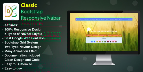
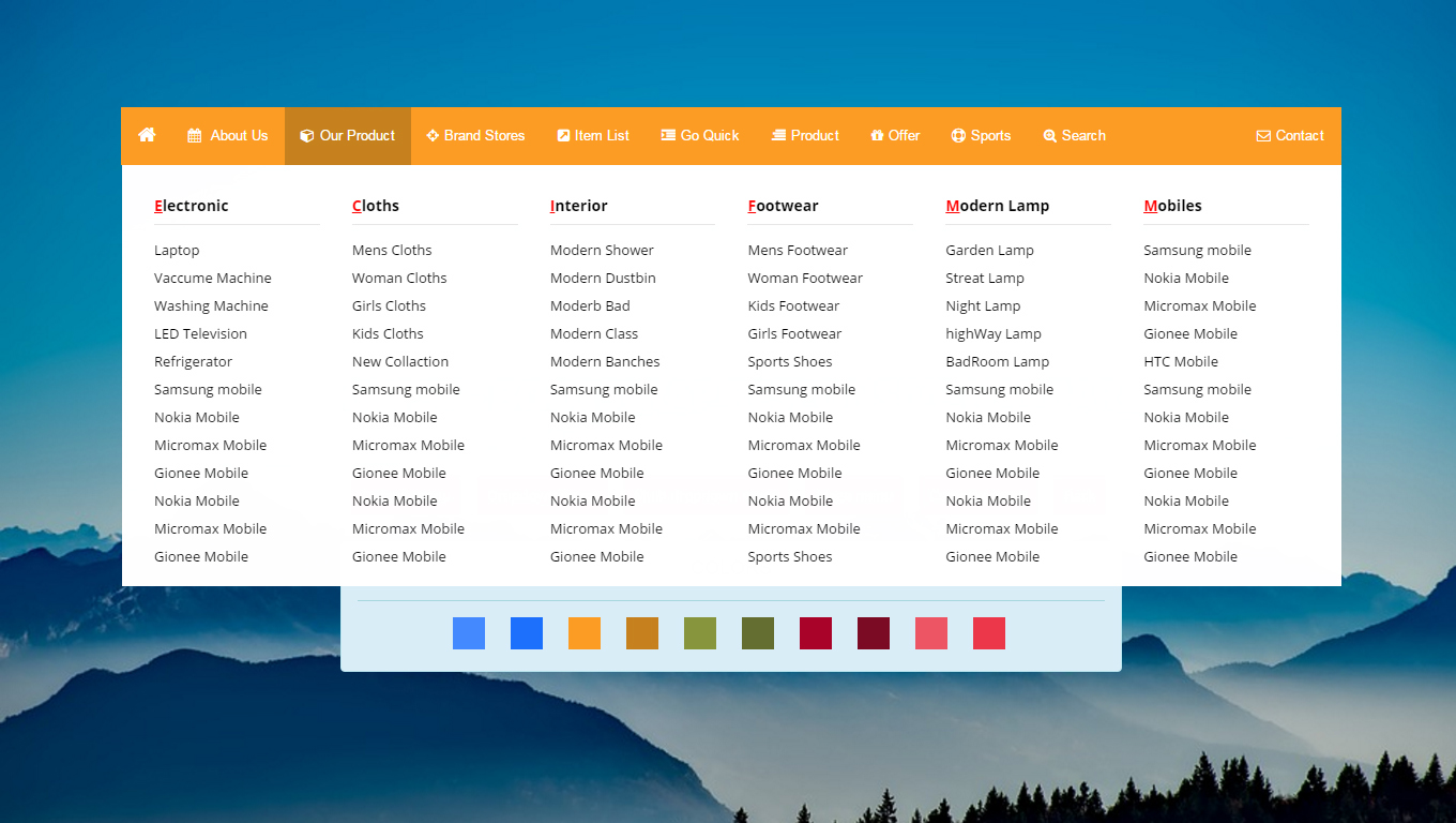
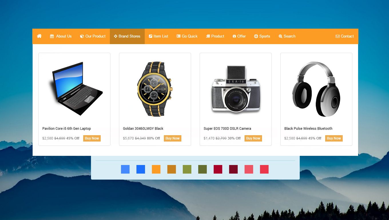
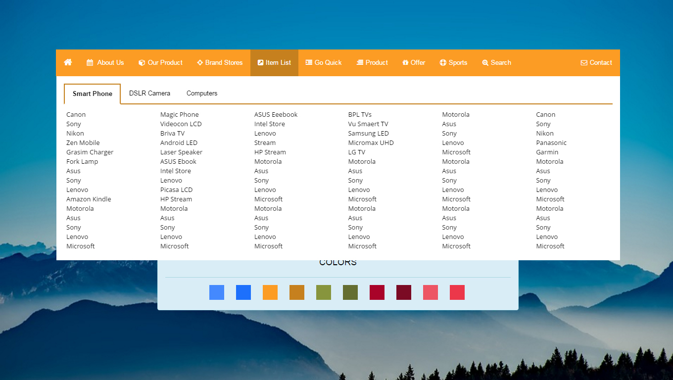
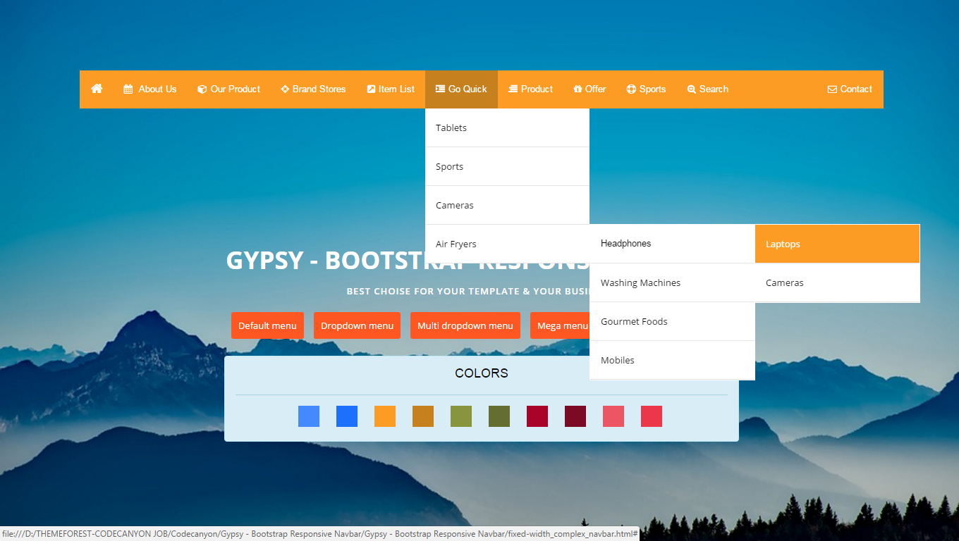
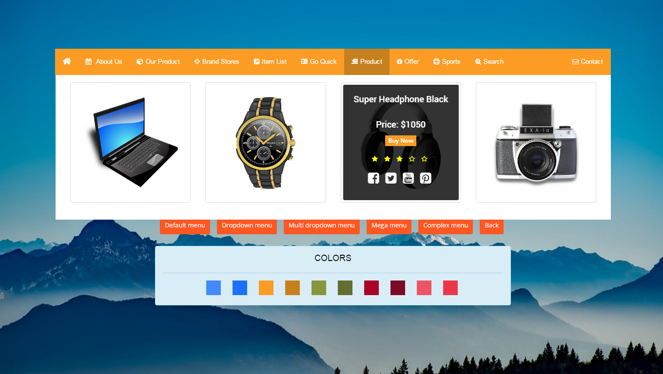
The GYPSY – Bootstrap Responsive Navbar is a professional CSS2 & CSS3 jQuery General Navbar compatible with Bootstrap. This menu comes with horizontal having 5 different types of navbars like Default navbar , Dropdown navbar, multidropdown navbar,mega navbar and complex navbar with all these four in one navbar in two different categories fullwidth and fixed navbar including 10 different color pattern.
GYPSY – Bootstrap Responsive Navbar is a flexible and high customizable to build your custom Bootstrap Responsive menus. It is very easy to build a horizontal navbar. you can set up the GYPSY Navbar item drop down by mouse hover. You can assign a 5 color and choose in 7 Different animation.
GYPSY – Bootstrap Responsive Navbar component based in CSS and JavaScript code. You can use Big Navbar as a horizontal navbar. It is a Bootstrap Responsive navigation, suitable for any type of website and Theme.
Features
- - 100% Responsive Layout
- - 10 Color Scheme
- - Google Web Font “Open Sans”
- - 12 Column Bootstrap Grid System
- - Drop Down with 3 Types
- - Many Animation Effect
- - Documentation included
- - Clean Design and Code
- - Easy to Customize
- - Easy to use
Live Demo URL: Click here
Sources and Credits
I’ve used the following: Thanks so much to
Font: Google Web Fonts
Fontawsome icon: Free Font Awesome, the iconic font
Images: Pixbay.com
CSS: Bootstrap
jQuery: Javascript
Support Facilities
If you have any questions related to this item. Please email us your before purchase product questions, installation request, customization project, and any other queries to here. Email: support@designcollection.in
Best wishesDesign Collection


