

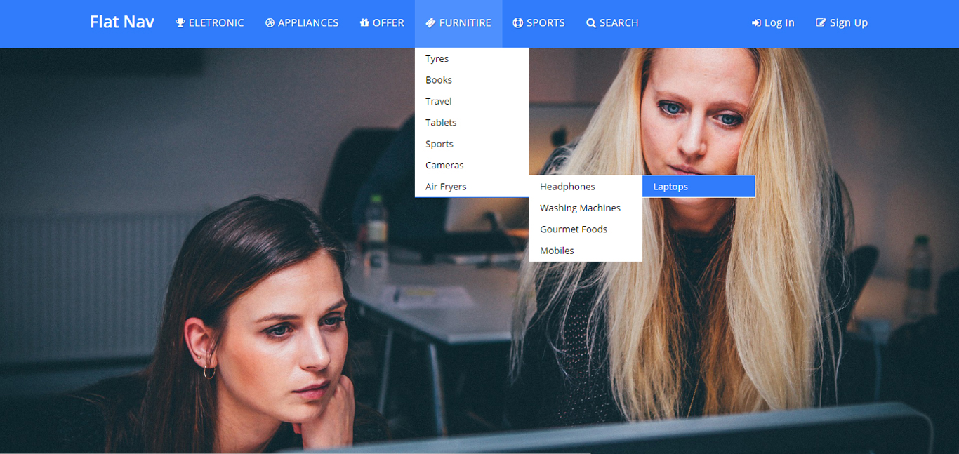
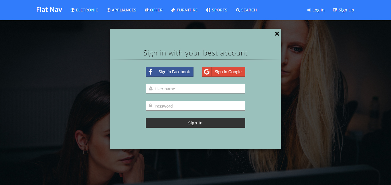
The Flat – Responsive Bootstrap Menu is a professional CSS2 & CSS3 jQuery Responsive Menu compatible with Bootstrap. This menu comes with horizontal and sticky version and 5 different color pattern and 20 different HTML files.
Responsive Flat – Responsive Bootstrap Menu is a flexible and high customizable to build your custom Bootstrap Responsive menus. It is very easy to build a menu. you can set up the Flat menu item drop down by mouse click. You can assign a 5 color and choose also gradient effect. other than added top fixed navbar.
Flat – Responsive Bootstrap Menu is component based in CSS and Javascript code. You can use Flat Menu it as a horizontal top menu. It is a Bootstrap Responsive Ecommerce Menu, suitable for any type of website and Template or Landing page.
Features
- - 100% Responsive Layout
- - 5 Color Scheme
- - Google Web Font “Open Sans”
- - 12 Coloumn Bootstrap Grid System
- - Drop Down with 3 Types
- - Flat and Gradient Effect
- - Documentation included
- - Clean Design and Code
- - Easy to Customize
- - Easy to use
Live Demo URL: Click here
Version 2.0 was released : Available Flat – Responsive Bootstrap Menu
Add new top fixed navbar
Fixed responsive issue in desktop and mobile
Add smooth animation
Set HTML element tag
Sources and Credits
I’ve used the following: Thanks so much to
Font: Google Web Fonts
Fontawsome icon: Free Font Awesome, the iconic font
Images: Pixbay.com
Social network button: lipis.github.io
CSS: Bootstrap
jQuery: Javascript
Support Facilities
If you have any questions related to this item. Please email us your before purchase product questions, installation request, customization project, and any other queries to here. Email: support@designcollection.in
Best wishesDesign Collection


