

Features:
Fully responsive: Circular menu is responsive and ready for use in desktops, tablets and mobile devices.
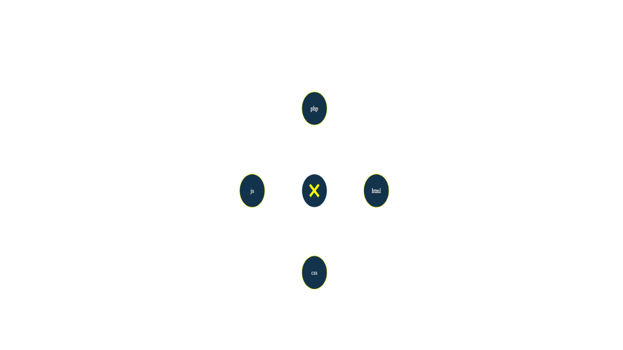
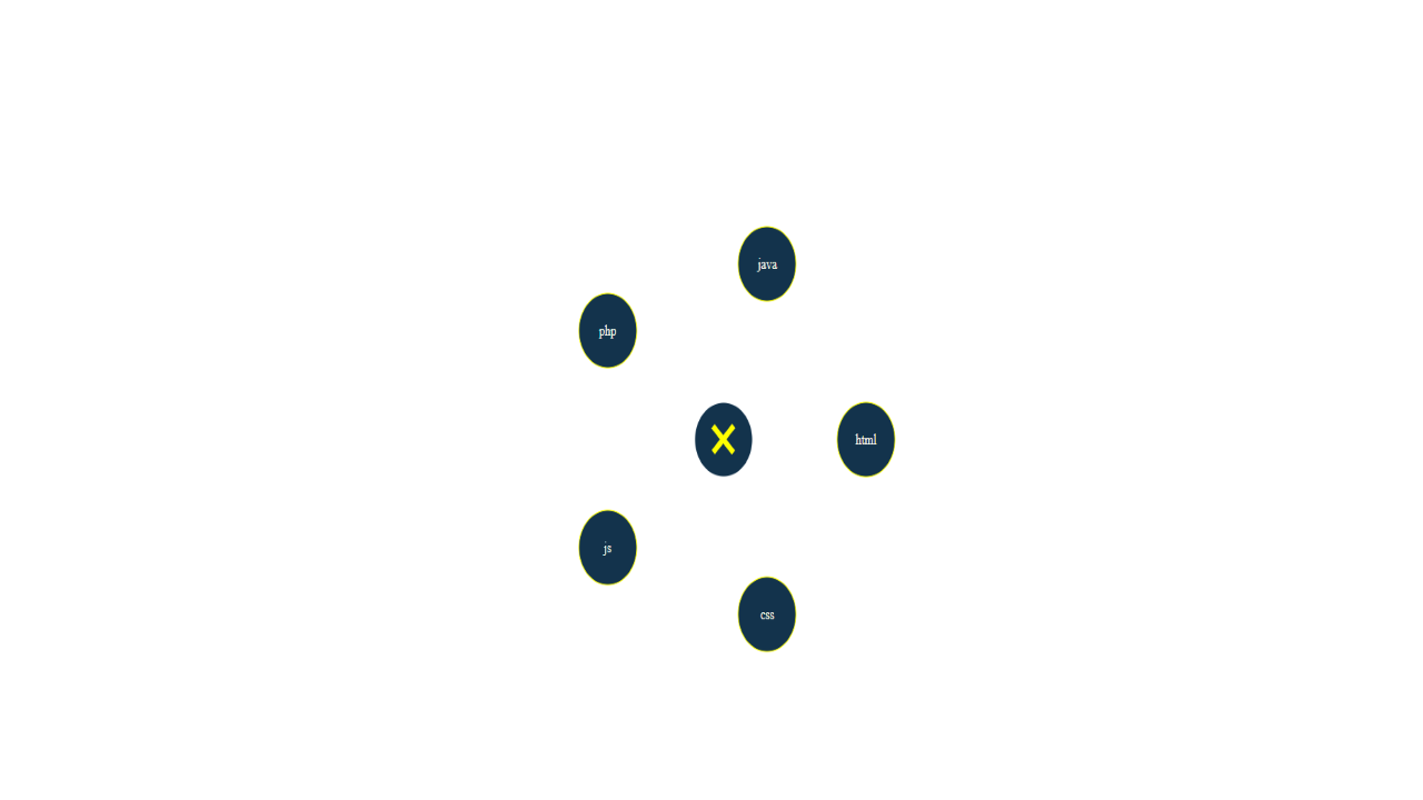
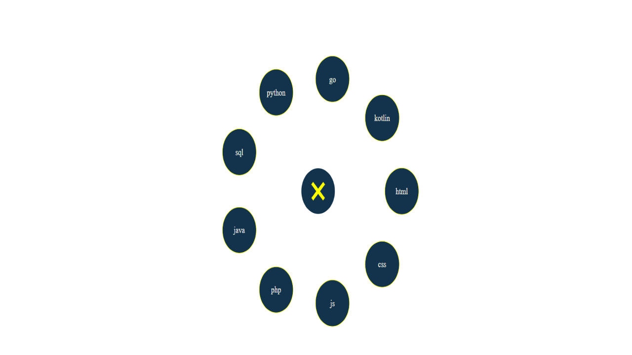
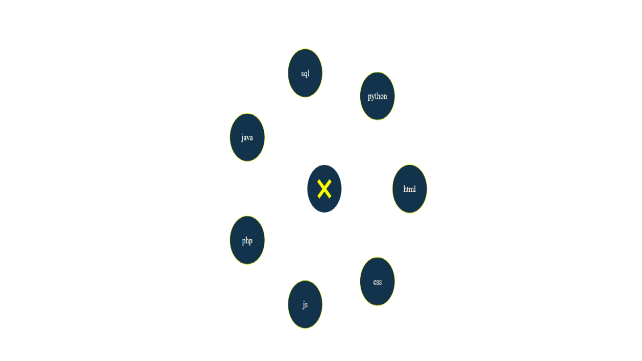
Simple user interaction: Just click on the plus to open the menu and click on the cross again to close it. Each menu item is a small neat circle that includes a link to any other resource or page on your site.
Any number of menu items: The menu works correctly with any number of menu items be it two, four, six or even more!
Cross browser: Support for all major browsers, including touchscreen devices and mobile devices.
Easy integration into your website: The circular menu can be placed almost anywhere on your website and will complement it with something unusual and delightful.
CSS animations: CSS 3 animations are available to give some stunning effects to the menu.
Free updates, bug fixes and improvements without additional cost.
