
106 comments found.
I have purchased your mega menu bootstrap. I want to make submenu navigation to be full width. Please guide me.
It’s not possible without extensive manipulation of the CSS, which is outside of the scope of support I can offer for the item here.
In your online demo, when displayed on a smaller screen size (in responsive menu mode), I’m finding the menu items are already expanded with a disclosure arrow indicating they can be collapsed. When I try to collapse them, I find it doesn’t respond. Can the menu items be collapsed?
Also I’m finding the menus themselves are not responsive, so items on the right are cut off as the screen width decreases, is there a way to have them reorganize so all items are visible regardless of screen width?
Other than Bootstrap’s responsive menu functionality – which is already provided… I’m not finding the menu’s themselves to be responsive… am I wrong?
Yes, the menu items are already expanded. Reason being, mega menus are not your typical menus and having them expand and collapse might not be the ideal solution for all, even though it might be the need for you. In which case, customizing it for yourself would be better. The menu provides you a good starting point from where to take off.
I’ll see if I can add some extra functionality in the next iteration though.
The demo does not have some responsive features enabled, as duly noted on the demo page.
Everything is working great now! Is it possible to change the button colors? I can’t seem to find the CSS code that allows me to do this. I want to change the buttons to hex colors #590000 and #FFF3C. Is this even possible?
Thanks in advance!
Dalton
The buttons have gradients, rather than solid colors. You can find the CSS for the buttons in the bootstrap.css file.
For example, search for “btn-inverse”, copy the CSS for that into your mega-menu.css file, rename the class to anything eg. “my-button” and then change the colors with the hex values.
Hope that helps.
One more problem, when viewing it screen devices such as iPhones and iPods, when the drop down menu is enabled from the button, it cuts off half of the second column on the right side. How can I make it to where it fits and adjusts to these devices perfectly? It looks wonderful on the iPad so far!
Thanks!
Dalton
If your target audience is the iPhone/iPod sector than you’ll have to do some of your own CSS adjustments to make it fit in perfectly. I imagine the only adjustments you would have to make would be for the CSS width property.
Unfortunately, I don’t have an iPhone/iPod. I’ll check to see if there are some good online simulators to test it in.
All though my main target is not the iPhone sector, its an absolute must that my website must function properly on all devices. A broken drop down menu= a broken and unusable website.
Here is what is looks like on iPhones.
http://i1293.photobucket.com/albums/b584/dhint23/photo_zps7f06e37a.pngAs you can see, the columns are not dropping and fitting like they should. I would so greatly appreciate it if you could tell me what to do with the CSS as I know its probably something very simple
Is that the demo site you are looking at? Because the demo site does not have some features enabled (as it’s a live site and I did not include the full CSS file), it states that on the page itself.
If you load one of the examples from the ZIP file you downloaded, here’s what you should see: http://i.imgur.com/DgPJa.png
That was not the demo website I was viewing. It was one that I created and implemented the menu into. What CSS file needs to be put in there to make it look correctly? I’m 99% sure I put everything where it was suppose to be.
Thanks
Dalton
You just need these files:
<link href=”css/bootstrap.css” rel=”stylesheet”> <link href=”css/bootstrap-responsive.css” rel=”stylesheet”> <link href=”css/mega-menu.css” rel=”stylesheet”>
Make sure you use the HTML from the examples included in the ZIP file, do not use the HTML from the demo page.
I’m having a few problems.
First, when I try viewing it with a Smart Phone or Tablet screen, the drop down button on the far right wont work. Is there something simple I’m not doing to not make it work?
Second, how do I add a picture to the left of the drop down button like the one in the live example? I want there to be something to look at besides a blank bar.
Thanks in advance!
Dalton
The drop down button has been working on all my tests so far. I’ll do some more tests to see if there’s anything particular I’m missing. As it’s built on Bootstrap, the core of the menu responsiveness is derived from the source code openly available.
You can check the source code of my live example to see how I’ve added an image there. It’s very simple.
I bought this code because you state it works on Ipad Iphone etc. The code in the download file is different than your live view. The download file when you click a mega menu nav link it opens, but does not close like it does on your live preview. Ive been spending many hours trying to figure out what the differences are from your download to your live preview. Please help as I would not have purchased if I would have know your download file does not work the same as what you are advertising.. Thank you
The mega menu shows by dropping down when you click on the 3 bars (which signifies the menu).
The navigation links within the menu do not automatically close the menu unless you add a special data-target attribute to it. If you check our example source code you will see it there:
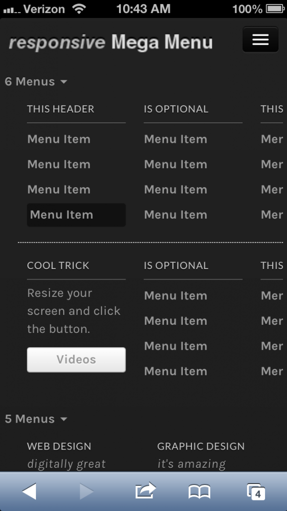
Resize your screen and click the button.
<a href="#videos" class="btn" data-toggle="collapse" data-target=".nav-collapse">Videos</a>
The above scenario would be useful if you want to direct users to an area within the same page. Regularly your navigation links would go to a different page and the menu would be reloaded collapsed.
I’ve just added it on one example link within the menu. I cannot guarantee it will work like that if you place it on ALL links, as I’ve not tested it for that purpose.
It’s just a proof of concept, you are free to modify it for yourself as you like.
Hi there, I dont know if you answered my question. If you click on your “LIVE PREVIEW” page from where you can purchase the script from an IPAD everything seems to work, fine. Zoom all the way out and click on a menu, then click again. It opens and closes fine. But then click “REMOVE FRAME – codecanyon logo” from the top. Everything shifts up and you will notice your mega menu script does not close when you click it again on an IPAD. The arrow goes dim but NO CLOSE. if you zoom in it closes, zoom out it does not. It will only close if you click anywhere outside the menu button you clicked to open??
This is what im talking about. You will need an IPAD to see what im saying. Please advise. Thanks
OK, once I get an iPad I’ll test it on there.
Hi, I was wondering, are you planning to release a version that works on a vertical menu?
Sure, I’ll try and include it in the next update.
Any chance this menu could be added to Wordpress? I have a bootstrap based them and am struggling with getting a megamenu to work. ?
I’ll start developing it soon. Have a few more features I want to perfect (in the CSS version) before offering the WordPress version.
For some reason this does not seem to work for me using internet explorer, does anyone have the same problem?
Hi, Which version of IE are you testing this with?
Thank you
Is there a site I can see this in action? I need to know if I could use it to show 6 columns like my site:
http://www.nrlbet.com/bet365.phpNot sure if users would be willing to show their site, but you can see the v1.2 video in the Live Preview to see the example of the 6 column menu.
Hi, looks really good – I would just like to know if (like jobu876 asks for) your next version will have the ability to make the menu appear the full width, so the submenus won’t be off screen?
If it does, i’m in line to buy ")
Thanks in advance!
I’ll test out some options and see what I can do about it. Can’t promise it though.
Sounds good. I have a hard time seeing how people can use menus that span 3+ without becoming rather useless in most scenarios…
If you pull it off, i’ll buy an extended license or two (and just it as a regular =)
Thanks in advance!
Hi, just wondering whether the “display the submenu on hover rather than click” has been implemented yet? You mentioned an update…has that been loaded yet?
Many thanks
I’m hoping to have it uploaded by the end of the week.
Update with menu display on hover has been uploaded.
Ok, I have now the moved to folder to the main panel, doesnt seems to work. (i have tried to link bootstrap/css/document.css)
Will wait for the wordpress version instead =/
It’s relatively simple to use. Not sure why you’re facing problems.
Maybe start from the top, without renaming anything and keeping the file structure intact?
“It won’t work with Headway, or any CMS currently, as it’s just a plain CSS /JS file. If you do know your way around implementing it you could do it theoretically, but that is beyond the scope here.”
Ok, thanks for answer.
But its a option “Live CSS ” in headway, where you can costum css/html coding, shouldn`t it work then?
It could work, BUT you will not be able to add menu items via the WordPress menu panel. As the HTML structure is important too in order for the mega menu to work as it is intended. This will require some PHP code as well.
We will be releasing a WordPress version sometime in the near future.
Huge deal breaker, it seems that the menus ignore touch screen input. Tested on a Blackberry Playbook, Blackberry Torch 9800, and a Samsung’s Galaxy Note II.
Do you mean the input in the search box? Could you please be specific, thanks.
I’ll see if Bootstrap provides any specific support for such issues and if they do I’ll implement it in the next update.
Sorry for beein a newbie, but i have looked at yout HTML examples, but nothing happend. Will it not work because it is linked to css/bootstrap, and i have it in folder etc/bootstrap/ ?
Do you also now if it will work with framework like headway? they use custom CSS , thanks
You should place the folders css/ img/ and js/ in the root of your site. If you change the path/source area of the folder then you will have to adjust it accordingly in the HTML as well.
It won’t work with Headway, or any CMS currently, as it’s just a plain CSS /JS file. If you do know your way around implementing it you could do it theoretically, but that is beyond the scope here.
Thanks…if I purchase today will the upgrade be free? And will it just be an additional control to change to have this functionality?
Thanks for the quick response.
Yes, you get free upgrades. Yes, it will probably be just a small HTML /CSS adjustment on your end.
Is it possible to display the submenu on hover rather than click?
Yes, it will be available in the next version release. Should be ready by next week.
oh, my bad. So I just have to throw it in my wordpress folder on my server, and link to it in some way in the css?
Well, if you want to have a manually updated menu you could do that. Have a look at the included html files for an idea of how it works. It won’t work with the WordPress menu system though.
